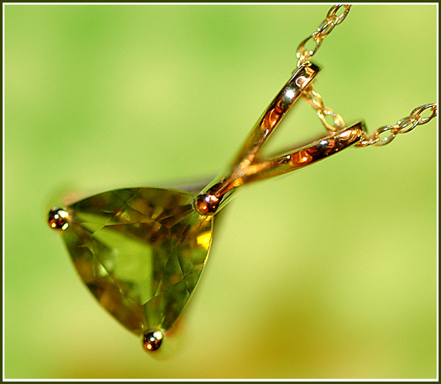
The first thing that stands out to me is the small spot of "stem" that is out of focus. Was this selectively blurred? The focus seems odd in some places. Focus on the stone is also soft. I'm thinking though that because the background shows through the stone, that it appears soft because of that.
The orange reflections in the gold are distracting to me. Gold isn't suposed to be orange, it's suposed to be gold, and seeing it as orange makes me thing that it's not right, which then I wouldn't buy it.
There is also a light reflection in the upper part of the 'stem'. Looks like flash or strong overhead light. That distracts a bit as well.
I like the angle and framing/cropping. The way that the necklace sits in the photo is appealing and adds interest to the photo.
I like the background color, but maybe not with the color of the stone being so similar. Not sure about that. Would have to see it different colors to see which I would prefer, but I haven't decided weather I like the combo or not. Maybe it was the best choice with the green stone. *shrug*
Overall nice shot which in my opinion would benefit from different focus options and lighting.
~Heather~
Edit to add that when I viewed this as a thumbnail, the colors seemed to work out just fine. The odd focus issues were not as visible either. This did make for a more visually appealing image, so I made my mind up that the background color is good, but it just needs different focus and lighting (to reduce the orange glare).
The background takes away from the color of the stone for me, maybe with a complimentary colored background instead of a similar color would have worked better.
Interesting depth of feild. I can't quite figure out what I'm looking at, or how it is shaped, but all in all it is an intriguing shot. Nice color, as well.
A nice clear photo. The reflection of the photographer is distracting from the image, although maybe not avoidable. I think the background would have been better in a neutral color, different that the stone color.
Love the composition. Very impresive use of shallow DOF. However, some part of the jewel are not in focus, especially the "V"; it's a bit distractive, especially since this part is dead center.
Very wierd and unique DOF and composition. I'm not sure which part is in focus and which is not, or what the shape of this item is. I like the colors and the Very strong DOF helps a lot on the wierd focus. Unfortunatly, i do not feel this sells the item a lot and so goes slightly against the challenge's theme (advertisement). Very nice tho. 7
I think this would have come off better with a different color background. The green is distracting against the gold and whatever color the stone is supposed to be. The photographers hand is also quite visible in the reflection of the top right loop.
We can see that you used the flash (by looking at the reflection in the pendant). Continuous, slightly diffused light from the direction of your choice would have been better in this case (IMO).






 Add photograph to your favorites
 Add photographer to your favorites

 Photographer found comment helpful.


