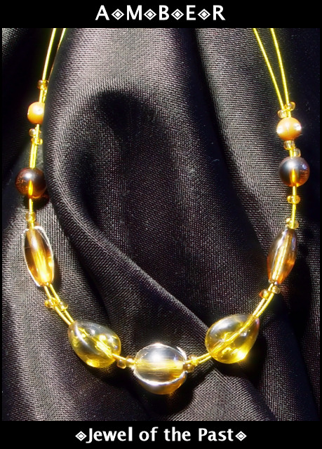
I love amber ... The lighting seems a little too harsh. I like that you used black to try to bring out the color of the jewels, but that bottom one seems to be reflecting too much light.
The fold in the fabric is distracting to me, as it seems as though it is hiding something. Perhaps if this necklace were photographed around someone's neck, it would have been more pleasing. The amber looks a bit washed out to me, but overall, it has a nice color. Also, it appears to be glowing - nice touch.
Very nice. I wish the light had been softened with a piece of paper to avoid the harsh glare on the amber. I like the texture on the cloth is is sitting on 8
A good add! I find the texture of the cloth a little distracting, but not too much. I think the lighting is just right, the highlights on the beads are quite bright but by no means over the top. Hope you do well.
To really make this work, the background's texture needs to be more plain. The weave of the cloth is too prominent. I like the concept, but a darker piece of cloth would improve it.
I like the way you've framed this and have the text in a border area outside of the image. The jewelry has a few hot spots from lighting which makes it seem a bit out of focus in comparison to the backdrop used. Overall a nice photo. Good luck.
Composition and background are good here. The arrangement of the folds in the cloth background are nicely done.
Text/font in the wording could be improved upon in my opinion.






 Add photograph to your favorites
 Add photographer to your favorites


 Photographer found comment helpful.


