Iam having a hard time seeing what what kind of jewelry this is.
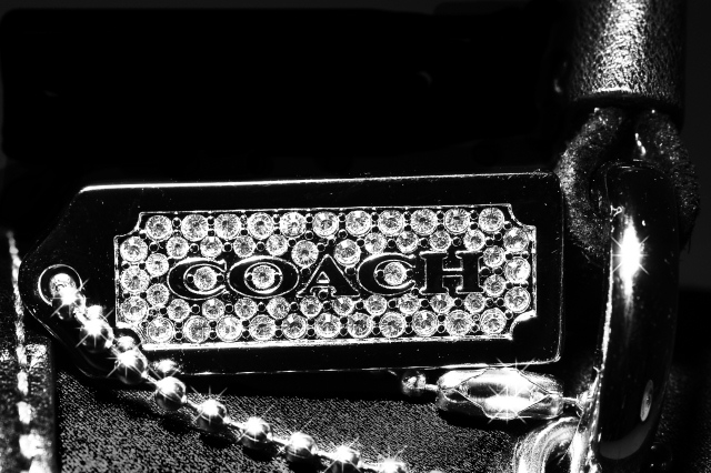
Image shiny and full of sparkle, is a little bit too dark in my opinion for an advertisement. (5)
While the concept is nice, the "ball chain" clasp takes away from the idea of diamonds...the two are not usually associated with each other in a consumer's mind.
Why not color? The impact of diamonds is lost in the B/W. Nice sparkle from the necklace but from the title I get the impression you wanted this image to be about the diamonds...
While the post processing is extreme, I understand that was probably on purpose to give it an edgie feel.... the problem I see is the composition. I find it difficult to understand what I'm looking at and in what context it's worn or used.
Good sparkles!! Like the use of b&w. good detail in the jewels. Not sure about the subject matter ("girl" jewellery and "coach"?) maybe slightly too much contrast and top space is a little empty/unabalanced.






 Add photograph to your favorites
 Add photographer to your favorites


 Photographer found comment helpful.


