Minimalism is about the simplicity of ideas, about the removal of the of the strange attractors that prompt the more sentimental of emotional reactions; it hopes to produce an artistic reaction from a new aesthetic.
I don't care what the challenge details say.
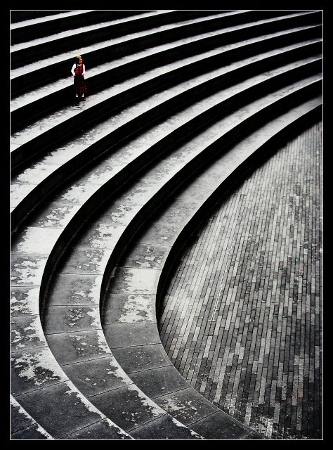
A few post-challenge comments. Yes, it's something like my fourth 4th place; The shot is not de-saturated, it's just exactly how this scene is - though the contrast had to be pushed quite a bit, which has given rise to the quality-control comments, I think. Within the basic rules of course, te girl couldn't be brought out whilst maintaining that punch in the graphic nature of the environment.
Statistics
Place: 4 out of 492 Avg (all users): 6.9576 Avg (commenters): 8.2364 Avg (participants): 6.7665 Avg (non-participants): 7.1667 Views since voting: 6358 Views during voting: 575 Votes: 377 Comments: 82 Favorites: 48 (view)
A fantastic composition. I wonder if you have this picture processed outside of the "Basic Editing" set of rules - I'd like to see what you *wanted* to do with it.
Now I wish I'd voted on this challenge & pushed you into the top 3 ! This was my favourite, it reminds me very much of a Denis Thorpe photo which I have on my pin-board. Captures the theme of minimalism perfectly, well done & congrats.
What a fabulous image !
Simple and powerful at the same time...the introduction of the child on the steps really adds so much to the overall effect(for me).
I`m starting to lose count of the number of 4th places you have had..(around your 4th perhaps?)
I didn`t vote in this challenge but knowing how you previously felt about "selective desat", I doubt if I would have picked this out as your submission on that basis alone.
Love everything about this - excellent stuff Ed.
And I don't care what the challenge details say either - which is why I'm going to submit a hexagon to the Triangle challenge.
beautiful repeating curves on these steps w/ nice effective high impact contrast. Child is beautifully placed, and captured w/ perfect timing. Wonderful picture.
This is so cool! I like the almost floating, surreal feeling about your image. I've seldom seen lines that string in any image. The various textures and patterns along with a great tonal range make this an absolute favourite. Congrats on your green ribbon, I think it should have been a blue one.
Congratulations on the top ten finish, I love the shape and lines to this image perfect for the challenge and black and white tones really compliment it.
This was my highest rated pic - I love the tonality. I take my hat off to you: your image captures minimalism fantastically. You took it in the same area as I took my pic, though I never thought to use the stairs (I just liked the plain granite as a background). I had kind of guessed that it must be you (esp. since you mentioned that you often walking around this area with your camera). Unlucky not to have ribboned, but well done!
I'm really pleased to see this do so well. Gives me a lot of faith int he voters, because it's a photo that needs introspection to truly appreciate. Congrats!
Awesome shot. The background is minimalist and there's a lot of texture there. the curving shadow is evocative and the pose, to me, says a bit about loneliness. one of my favorites in this batch of 450 or so. 10
Beautiful! Stunning form, contrast, textures, and focus! I think the border does and nice job of containing the motion of the lines to help you back to the subject.
the lines are amazing, i wish there was a little more detial in the child... for example the black skirt (?) is blending into the black line behind her. but still this is really awesome. 9
I don't get the title (probably just don't understand the cultural reference) but this photograph is amazing. This is the 2nd 10 I've given out, and like I said to the other person, the 10's are unmistakable, you know them as soon as they pop up on the screen. This was definitely one of them. Although I do have to ask - isn't it illegal in the open challenges to do spot desaturation? Or... is this how it looks in person? I really hope it's legal, because I think this is a ribbon hopeful.
Good shot, love the curves and the sense of space surrouding what appears to be a lonely child spectator. The only thing I would suggest is a slight rotation to the left, just a tad. Anyway it's a 10
I probably would have liked this image more in all black and white. This is not because I am "against" selective desaturation, but more, that I like your black and white treatmen a lot and I think this could be improved by having the entire image undergo that treatment. This is a very good shot and very well done for the challenge. I will give it very high marks. However there does seem to be some jpeg artifacts and "jaggies" that may be due to either over-sharpening or you may have had some problems in the actual compression of the original shot. If you would like help on compression, feel free to PM me and I will be glad to help you out so that you may submit the best quality shots. Good work, keep it up!
An excellent image that caught my eye immediately. The pattern you have captured is really neat, and the rectangular tiles at the bottom add a lot. 10.
Stunning use of light and shadow to really strengthen the geometric impact of this beautiful amphitheatre and great choice to use black and white to really bring out the textures of the paving. Whilst I like the position of the child within the frame she doesn't, for me, provide a sufficiently strong and obvious focal point to stand up against the striking location itself. I don't know if it would work better if she were wearing a brighter colour (left unsaturated) or, if left in black and white, all white clothes might stand out better.
Wow! Great. One of the best. I like the composition, the way the curves of the auditorium fill the frame. Good placement of the minimal subject wich do dominate the image. Good colour on the b&w background. Well done! 10
VERY good, still not a 10 from me but a 9 easily, hope you do well. I especially like the composition int this shot and the texture and tonal range in it.
I'm torn on this one. I like it a lot. Love the straight lines mixed with the curved. Love the symmetry. Like the selective desaturation, or more correctly, the selective saturation. But the little girl doesn't seem to be the subject to me. I'll give you an 8 & predict a top 5 finish.
love this but your subject seems a bit dark and too far away...actually I'd like to see a shot with her at the bottom right looking squarely into the camera
Very nicely shot - I love the abstractness contrasted with the reality of the child. The rotation of the photo wiht the pattern of the floor being parallel to the left edge gives the photo a little feeling of imbalance - did you try it slightly rotated clockwise? 7
I hope you didn't use selective desat for this picture, because I sure love it and I would hate to see it getting disqualified. It is one of the best shots for this challenge!!!
the child give the shot great perspective, I just wish she wasnt quite so dark. great framing. this is a very, very nice photo. brilliant.
this is one of my top scores for the challenge.
This is wonderful. I wish the girl stood out just a wee bit more, but not sure how you would've accomplished that. I'll be disappointed if this doesn't place in the top ten!
I really like your take on the challenge. the contrast of repeated curved lines and repeated straight lines with the solitary figure is very impressive. Well done and good luck!





 Add photograph to your favorites
 Add photographer to your favorites

 Photographer found comment helpful.


