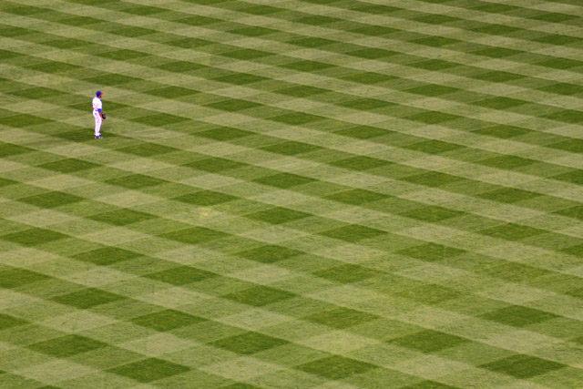
Tried this at a Phillies game last week, just had a lousy POV....you had a much better vantage point than I and the result is much what I was trying for....aaaacch! I hate you!.....not really....Love the patterning of the field and the subject is well placed compositionally. Still jealous but I like the shot. 9
This is as minimalist as it gets! I like this a lot and the pattern of the cut grass adds a lot of interest to the picture; yet the player draws the eye..
I have several pictures like this and I always find the geometric designs of turf/grass interesting...nice composition...perhaps saturate or darken color of grass a tad? nice job on crop and rotations so that grass design is parrallel with frame..gl 6
The placement of the player is good, but I think that you could have come a little bit closer in and still kept him as a very small portion of the photo. That would give us a little more clarity where the subject is concerned. I also like the checkerboard of the field :-)
Commenting only. Nice. Wow, wish I could get such precise lines on my grass. I'm only commenting on the few pictures that are interesting. I'd like this better if the player were more in focus. gl
Meets challenge description, 5pts the designs of the grass is overpowering the ball player giving the view that the lawn is the most important part of the image.
Meets the definition of Minimalism. 6pts
Technical, 5 pts needs more attention to clarity, maybe focus or noise in image.
Artistic, 7pts, this is an interesting image to look at.
The shift is on. Must be Barry Bonds is at the plate. At first this image didn't capture my attention, but the more I view it, the more I like it. This is an excellent example of the defination of the challege. And now that my eyes are all fuzzy from looking at the shadowed grass too long, I must score and move one. <7>






 Add photograph to your favorites
 Add photographer to your favorites


