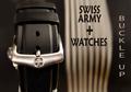
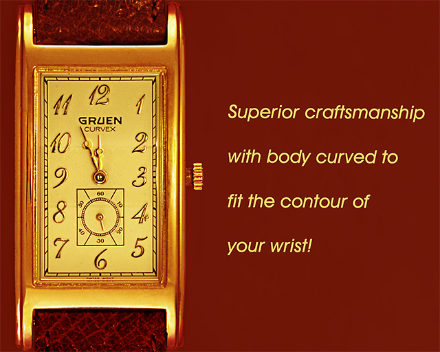
Shot with red (lit from bottom) background to tone upper and lower extremities then discarded background and replaced with fill layer.
Now, this is a curved watch and no one would accept the normal lighting so I worked on face to eliminate the curve lighting which would have brought endless controversy. Typical burn and dodge and clone. Then employed image in layer with softlight.
Statistics
Place: 43 out of 159 Avg (all users): 5.9174 Avg (commenters): 6.7714 Avg (participants): 5.9000 Avg (non-participants): 5.9296 Views since voting: 1134 Views during voting: 358 Votes: 242 Comments: 38 Favorites: 0
This has such a pleasant, warm feel to it. The strong right-angle structure of the layout seems to contradict the "curved...contour" description in the text, but visually, the image and text make for a very strong graphic. (8)
Very strong and rich lighting on this picture. The gold effect of the watch is very stunning. I'm not very keen on the background colour tho; the monochrome effect seems to take lots away. Text is good if perharps a bit too intrusive for my taste, its colour is a good choice. I have a few hickups about the bracelet tho, there are wierd lighting spots (reflection?) which kind of take away from the nice leather effect. Very good selection of 'time' (that was my big mistake in this challenge) as it doesn't obstruct the name or important informations on the watch. Good work! 7
The detail on the watch is very good and I like the choice of background color very much. the composition could be better as could the placement and font of the ad copy.
Composition: 10 Left third and center third well done
Technical: 10 The colors and choice of background colors really brings out the contrast of the image.
Creativity: 10
Challenge: 10
Overall: 10 well done good luck
Nicely laid out composition with a complimentary color for the background.
Only thing that isn't coming across well here is the style / size / spacing of the font. Not sure what may look better, just seems at odds with the watch. (6)
A very bold add. I'm not too keen on the choice of background colour (& text colour), but I understand why you used it. I'd like the watch to stand out a bit more. Technically I think the photo is excellent.
Very crisp and fantastic comp. Text is wordy and vague and also seems tilted. but the font and color are perfect. Nice match on the background color. Overall a very good job.
Nice image. not to my taste. Text does not feel "right": not enought of it to look like an advert, but too much to act as a byline. Font does not fit the style of watch - watch is a bit fussy, font is plain and simple.





 Add photograph to your favorites
 Add photographer to your favorites

 Photographer found comment helpful.


