I keep getting "WOW"-ed by your pp work. It is extraordinary!
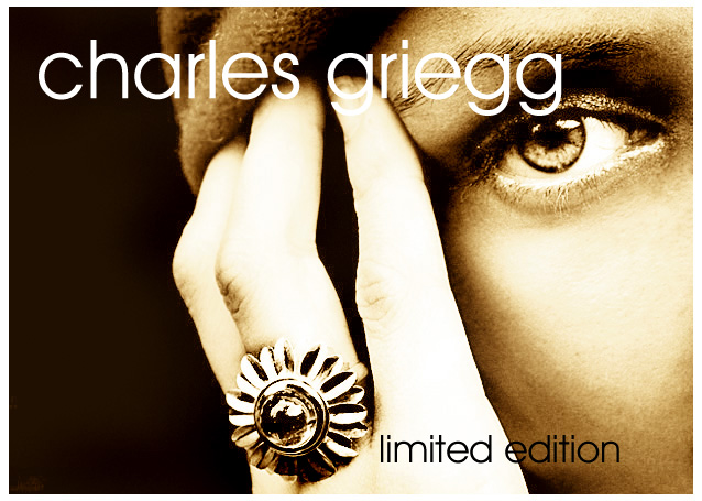
The photo looks so glamorous, made of gold.
Funny, the ring itself is so contrasted, that it has wild hot-spots against too dark parts. Yet, it attracts the eye so beautifully, I would go look for this ring in the near store!
As an add - it works wonderfuly. As a photograph - it's even better!
As a photographer, you definately are in the right place :-)
Congratulations on your 4th placement. This is by far the boldest and most creative effort in this challenge. It is an image that many shy from because of the many calls that have to be made to bring it to finish. And then, the presentation. Kudos.
I like the graphical representaion though i believe a little more attention should gave been paid to the ring. Otherwise the image is attractive because it can stand on its own. Bumping up.
I like the image a lot, but for advertising a piece of jewelry, I'm not sure sepia is a good choice. A good shot like this will grab a consumers attention, but to get them interested in buying the piece, they're going to want to see what color it is.
A really cool, simple, modern image. The text/font compliments the picture and doesn't overwhelm the entire image...I'm also drawn to the sepia, I think it keeps this from becoming too busy with color...it forces us to notice the wonderful textures going on in this inage, very nice.
I hope this does well. Some people may pick on the blown highlights and the extreme lightness of the hand but this, to me, looks like an ad from a very high end store. I hope others see the art in it. This like an example of knowing what the rules are and then breaking them on purpose to achieve the desired effect. 10 from me.
This is a very professional affair in terms of the composition, toning and text. This could so easily appear on the back of a magazine. Some may complain about the string lighting on the fingers but I think it really adds structure to the image. My only criticism is that, rightly or wrongly ,most jewellery ads tend to err on the side of 'glittery opulence' whereas the ring here is quite flat. High scorer nevertheless.
I really like the image but cannot decide if the blown out highlights are a benefit or not, maybe it would work better if there were no blow outs on the actual ring - there again I cannot imagine how this would look (or work).
Whatever, I like it - well done :)
one of my two faves in this challenge. i like the colors and composition. i know that text serves the purpose of advertising, but i would love it without any. (10)
Excellent advertising shot. The tones are wonderful . Well thought out. The whole presentation is very nice. The only thing that I would like to see different is a tad bit more detail on the ring. Possibly if the tones on the hand was closer to the tones of the face would be enough to bring out those edges of the ring that seem to disappear. Very Good shot. One of my top picks.
Love it! This could be in a magazine for sure. Even though its overexposed (i know this is on purpose) and it looks very processed I've seen plenty of ads like this and it has an appel to it. Nice work! 10
great job i feel like i opened up the new york times magazine section when i saw this.....well done from the representation of the product to the use of the model almost daring you to take whats hers....best of luck
Love the color treatment and the whole texture of the image. Nice font choice and a flawless layout. Only thing that bothers me a little is that the highlights on ring finger and the little finger appear blown out. still giving it an 8
It has some lighting flaws, but I love the composition setup, text positioning and toning. The eye and the ring are the most dominant element, I think that's good. It's just that I am not comofortable with the light on the hand and ring. 9
I love this idea and the composition. I even love the tones and high contrasty nature. My eye is drawn to the eye rather than the jewelry, though. Had you tried something similar with the jewelry being quite clear? Bold idea! 8
I like the weird choice of lighting and tint you've used here. The font and layout is very effective. I like the sharp focus on her face and don't even mind the blown highlights on the hand and ring. 9
love the design, wish the hand and ring would have had the same tones and quality as the face i.e. less blown out and more toned.... i really really love the eye and the tones in the face.
This has good balance. The eye and the ring both command the viewer's attention. You've also done a good job of placing the text to enhance the image. Well done.
great, great comp. Great text placement and use of negative space. however the ring doesn't jump out at me and makes it difficult to know what its an ad for.
To me the winning photo of this challenge. The only thing I would add is that you might have picked a more salable or interesting ring. But your print and photo etc...are execellent!
This could grace the pages of any top magazine..I love the soft monotone, and the cropping to reveal only one eye, the placement of the hand with ring catches your interest immediately because of the lighter tone and being central in image..9
Excellent composition. You chose a high key exposure which gives this shot a lot of style. Lots of contrast on the ring, which I feel works as well as the softer lighting entries in this challenge. 9
full package! good placement of text, highlights the ring, interesting composition. Only suggestion: hand is a bit blown out and detracts a small bit from the rign. One of my favorites this challange
Very realistic-appearing kind of shot.
From the thumbnail, I was about to comment on the size/text used, but after looking at this a bit longer, realize you studied real ad work (assumption anyway).
Dude, you'd sure get more points from me if it was not for that big distracting "charles griegg" that is totally screwing up your otherwize very original and well executed shot.






 Add photograph to your favorites
 Add photographer to your favorites

 Photographer found comment helpful.


