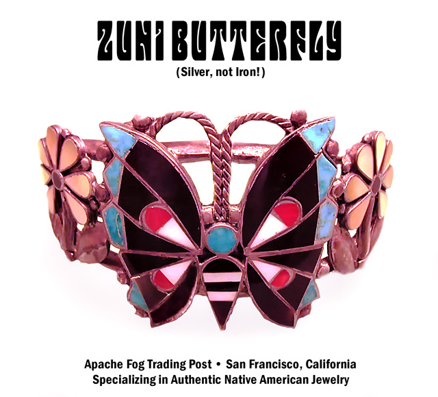
Shot this Zuni bracelet at the bank, in a safe-deposit booth with overhead fluorescent lighting. Handheld, macro mode.
Inlays include black obsidian, turquoise, coral, abalone, and some other shell.
-Cropped and straightened a little.
-Cloned-in a missing piece of obsidian
-RGB Curve
-Created masks for the shadows
-Variously smudged and blurred the shadows a bit
-Applied RGB and Blue Curves to shadows through the masks
-Added type: contemporaneous (with the band and when I bought this) hippie-era font (Mojo) plus Franklin Gothic Demi Condensed
-Saved composite as TIFF
-Mild noise reduction using Picture Cooler: Luminance reduction -2.9
-Made selection excluding type; applied USM at 16%/64 dia/TH=0
-USM at 88%/0.8 dia/TH=5
-Save as JPEG at 8/10
Statistics
Place: 76 out of 159 Avg (all users): 5.4980 Avg (commenters): 6.5769 Avg (participants): 5.3333 Avg (non-participants): 5.6154 Views since voting: 1252 Views during voting: 373 Votes: 245 Comments: 28 Favorites: 0
I like the lighting here but it has a pinkish cast to it which may actually reflect the true color of this piece, but appears somewhat odd. I think this works very well for an advertisement. 7
Thanks for this and all the other comments. This is probably another case of my red-green color-blindness showing up ... I just don't notice things like a "pinkish cast" in many cases.
I must have an extra space character in the lower type, because it was a centered block according to Photoshop; I guess it could have been a little smaller, but I hate ads which make you get out a magnifying glass to read the phone number or whatever.
I love this one. It doesn't shout "creative", it just renders the object skilfully and incorporates simple, effective text and a striking title font that works very well.
Original piece and ad design. Many probably won't get the name play on the musical group. The silver needs to be more brilliant and there needs to be more contrast. Placement and Comp are excellent.
I like the lighting here but it has a pinkish cast to it which may actually reflect the true color of this piece, but appears somewhat odd. I think this works very well for an advertisement. 7
Main title font kind of hurts this one in my opinion.
Hard to read, and the caption "Silver, not Iron!" almost doesn't belong in an advertisement in my opinion.
A unique take on this challenge and the photography is good overall.







 Add photograph to your favorites
 Add photographer to your favorites


 Photographer found comment helpful.


