Story behind the shot -
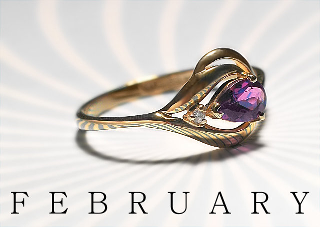
Was chilling out with my friend who lives down the hall and remembered the jewelry challenge. I know she has some pretty cool jewelry so I asked if I could see her collection. She said I should take a photo of her birthstone ring and she picked the title. I needed a background material to put the ring on and was going to do a flat black or white background instead, so I started flipping through a magazine she had nearby to find a plain page. I stumbled upon this really cool/wierd starbust pattern and immediately decided thats what I was going to use. The reflections turned out amazing :-)
The light came from a reading desk lamp positioned somewhere above the ring giving the cast shadow underneath.
This is a very strong image. Well composed, good lighting, and an excellent choice of backgrounds. The reflection on the background in the ring is very good. The use of DOF to draw your eye to the stone is well done. When any image is critiqued, something always can be found wrong, if you nit pick at everything. That is not what I would call a good way to critique an image. This image is just good and I can’t say anything bad about it.
Well done and keep up the good work, I hope to see more of your work in the future.
I really like this one! I've done a bit of jewelry photography and frankly I've always thought something was missing. Here's an example of an extreme macro shot of an earring that is about 1cm.
I really like the background pattern you set up and how nicely it reflects in the ring. Great decision to selectively lighten the background--it looks classy. (8)
Love the reflective technique used - hope you'll describe your process after the challenge. On the (very minor) negative side, the gold on the top of the ring looks almost tarnished. Great photo, 8.
super presentation in lighting of hard to render metal and gems ...
one of the best in the challenge ... coupled with creative curved radials make this a real winner
Probably one of the finer examples of using and controling reflections to make an interesting shot. While parts of the ring are a bit dull, the overall shot is one of the best, in my eyes.
font is too large for my tastes. the detail and exposure on the ring are quite good and I like the reflections the ring picks up from the background. I would have liked to see the background, great choice of background, BTW, a bit darker while not losing the good exposure on the ring.
Beautiful! I love the reflection. Type is appropriate size and font IMO. If I had to nit pic- the top of the ring could be more polished. Very nicely done.
This was a surprise.
The thumbnail certainly didn't do this justice. The reflected banding is a nice touch, and overall the clarity & detail is very good. Colors work well overall here, and the text / font used work for me. (7)
In the thumbnail, the background looks weak, but as you expand the photo, it works well with the subject ring. I love the focus and clarity of the image. Great DOF. Good lighting. Among my top picks. Hope this does well in the voting!
Nicely done! Love the background, the color and clarity of this image. Nice positioning of the ring to maximize the background reflective effect. Good luck in the challenge.
Wow. This is really good. The comp is great and the lighting purely professional. The reflection on the gold shows great attention to detail. The text is well placed and stands out. Excellent, excellent. With this DOF though, I'd like to see a different angle to show a little more stone.
I love the lines, the form of this ring. And I love its color. Perfect lighting, DOF. The backgound definitely adds interest, espscially in the reflections.
The text adds weight and balance to the photo where it needs them, yet somehow it doesn't quite work for me. (Thinking out loud: While the serif font seems appropriate for a ring that appears to have a little age, I think its flowing lines suggest either sanserif or something a little cursive, possibly purple, and perhaps bunched up more on the left side. But I know nothing of these things.)
Good lighting and good choice of text and font....
This is my second pass at this. Im bumping this up a mark. I can see no reflections and the lighting is really stunning. Only thing I would do different is turn the ring a bit so its face on. I am predicting a top 10 finish for this one. Good job. 7
Wow what a fantastic backdrop. I think the lighting could have been softer however as the shadow is a bit too hard and the contrast on the ring is a bit too harsh. But overall I like this entry. 7





 February
 Add photograph to your favorites
 Add photographer to your favorites


 Photographer found comment helpful.


