Author Thread
Post actions
Pretty good considering the 'studio' equipment you have.
Post actions
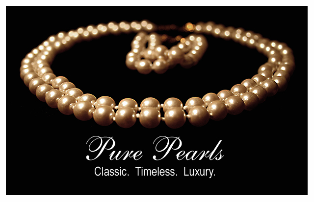
This one is really nice. I like the dof and the lighting a lot. I would have liked the pearls laying not quite so flat. One of those headless type necks they display necklaces on would work well here. I agree that the border doesn't help the shot. I don't think it takes much away, but just not needed.
Comments Made During the Challenge
Post actions
Not sure border helps...maybe a darker shade of pink, gray? Very well done design and layout though.
Post actions
This would be a great ad. I don't know if it's just my monitor, but the pearls look sort of bronze or brown, somehow. Otherwise, I love it.
Post actions
Pearls seem a bit dim to me, otherwise a fabulous job. Great graphics, too. 7
Post actions
Hmmmm, I'm torn. I like it the way it is, but I'm curious what it would look like with ALL the pearls in focus, or at least the leading edge of the earings (they ARE earings?).
Post actions
Nice concept ... simple and elegant.
Post actions
Post actions
This is quite nice, I like the centered composition on the black background, the text works nicely too. Nicely done.
Post actions
I like this. the pearls have a nice radiants. the fonts are nice as well. 9
Post actions
Post actions
Dear anonymous participant,
Post actions
be careful with your white balance and color balance...looks a little to tungsteny for my taste
Post actions
Would be absolutely stunning with white pearls.
Post actions
Nice composition and lighting. A very classy ad.
Post actions
This is lovely in conception, nice to look at until one gets in close. Unfortunately the forwasrdmost pearls are in front of the zone of sharpness and this hurts you badly IMO. More DOF would have done the trick. 7 from me, I really like the design, fonts, and tonality of this.
Post actions
A nice shot and layout, but I'm wondering why you didn't make them a more "pearly" color.
Post actions
Nice layout and concept. The lighting seems a bit warm - or you are selling low-quality pearls. Too gold.
Post actions
Very nice - I like how they blur in the background.
Post actions
Great text, good contast and nice layout.
Post actions
Post actions
I love the glowing nature captured in the photo of the pearls.
Post actions
Post actions
Post actions
I can really imagine this as an ad! Great shot
Post actions
stylish and very professionally done nice work 9
Post actions
I really like the comp here. A deeper DOF and more contrast is needed to make the piece stand out. I like the text placement,
Post actions
Nice DOF. Good sharp focus on the beads and nice lettering.
Post actions
This looks like a ad. I wish the [earls were a little clearer in the front. Still it is a very good example.
Post actions
Looks great. I'm not sure about the shallow deepth of field though ....
Post actions
nice advertisement. simple and precise...good job.
Post actions
Love the DOF and the text is just perfect. I gave this a 9 but I would have liked to see a little more light on the pearls. Good job.
Post actions
Post actions
nice pearls, they are very hard to photograph
Post actions
nice sharp focusing. great framing. nice background and lighting. 9
Post actions
very nice...like the border!!
Post actions
nice idea. would be better for me, at any rate, if the front pearls were in sharper detail.
Post actions
Very nice. Only issue is the crop is maybe a tad tight and the pearls a tad yellow.
Post actions
Post actions
gl ...nice shot and layout...clasp is BRIGHT
Post actions
the pearls look very yellow..would either make the text more creamy and yellow or whiten up the pearls





 Add photograph to your favorites
 Add photographer to your favorites

 Photographer found comment helpful.


