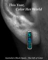
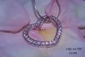
The sparkles on the crab and the earstuds are actually "real", the one on the necklace was slightly enlarged via photoshop.
Just some very minor adjustments (levels, contrast, brightness), resize, text, USM, safe for web.
If only drop shadow had been allowed :-(
Statistics
Place: 49 out of 159 Avg (all users): 5.7366 Avg (commenters): 6.5313 Avg (participants): 5.5876 Avg (non-participants): 5.8356 Views since voting: 1255 Views during voting: 349 Votes: 243 Comments: 34 Favorites: 0
I like the concept, but it would have been nicer were the jewels closer together. It took a minute for my eyes to focus on the jewelry, they kept straying to the shells.
I like the layout and idea here. Given the light tones of the jewelry, though, I think a darker background, like the tone color behind the necklace, would be more effective. 7
A little bit "busy" in the composition overall in my opinion.
A different font and perhaps something less in the way of text like:
"Dazzle her this Mother's Day with our Summer Dreams Collection" may have faired better.
So far this is one of the best. The composition, clarity, concept and lighting are good. The only thing I can see that bothers me is the cut off stone by the necklace. It seems like it should have been either in or out of the picture. Just as a fyi. When you work with sand, take a paintbrush to feather around where you worked.
Composition: excellent - well balanced
Lighting: the flares on the necklace and crab to my eye seem to be off slightly from where they micht be actually
Color: very good, would like to see better definition between the silver and pink
Clarity: very good - as jewelry is a lot different texture than the natural elements, it looks slightly out of focus.
Lettering: average - I would have liked to see a different font used
I'll give you points for originality, that's for sure! Too bad there is so much text... distracting. Lighting could use a facelift too. Composition is nice.






 Add photograph to your favorites
 Add photographer to your favorites


 Photographer found comment helpful.


