Thank you for entering the DPChallenge, Jewelry Advertisment.
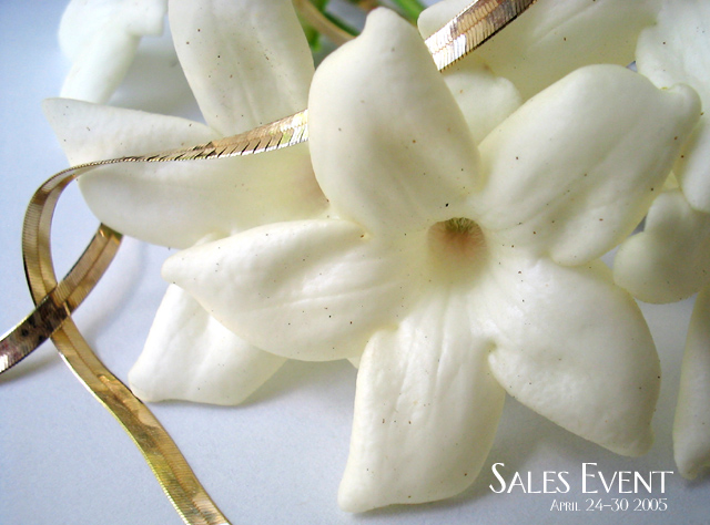
It does look very tropical and elegant. The flowers you picked are beautiful and compliment your jewelry selection. The soft blue and white colors creates a soft and calming effect. It does take you somewhere warm and tropical, with a cool breeze coming through the window.
The flowers however seem to overwhelm the subject. They seem to cover and hide the necklace. It appears that the necklace is possibly too long for the display. Its seems to have no beginning or an end to it. If you are selling a product like jewelry, the entire product must be seen. You also get the inpression because of the placement of the elements that this ad is selling flowers or jewelry. A confusion is created and there by some distraction. This very unfortunate, since this is a potentially a very beautiful display.
Technically your shot is sharp and well presented. Your close up of the subject is very good. Your composition is well thought out. I like your font choice. Its the type you see in your newspaper and magazine ads. You do come away feeling that the jewelry was struggling with the flowers for attention.
Overall a good job. Work on your subject presentation emphasis.
Did you try many setups for this one? I like the concept, just wandering in you could have made it a little more interesting by movingt the "chain" to the foreground. (I´m not shure it would make a difference). I find the flower a little soft. Like the picture though.
This is a very good concept but the necklace did not get the required attention to bring out its texture and golden tones. The flowers win. Bumping up.
I really like the idea behind this one.
Only comment overall is the gold seems to be taking the back seat on this.
More chain or a tighter crop would at least make the instant impression (main focal point) as much or more bout the gold than the flowers. Nice text/font used and great job on the lighting! (8)
It's a nice image. I think I would prefer to see more emphasis on the jewelry, but it's ok. Did you try a darker background like navy or black? Make everything pop a bit more. Overall, good job.
Please forgive me for being so bold as to suggest it, but would Jasmine and Gold be a better title? Jasmine is fragrant, rare, fleeting, expensive, remote, highly desirable, feminine, beautiful. Gold is solid, permanent, expensive, highly prized, feminine, beautiful. And the photo does a great job of suggesting their strong symbolic resemblances. I'm afraid 'Sales Event' conveys to me a big rambling mouldering or temporary structure that smells of mold and dung at which herds of livestock or semi-trash are traded. What's wrong with this image?
Nice composition. I'm a bit worried that the jewel of the picture is not or does not appear to be the 'primary' item in the pic, making it hard to see the item properly. Lighting is good tho. Be careful in the reflections of the item as well. Dig the font used for the "sales Event". What is it? 6





 Add photograph to your favorites
 Add photographer to your favorites

 Photographer found comment helpful.


