PhilipDyer: Excellent comment "Very good setup and composition. I think this image would look even better with a darker black point and a lighter white point to increase the overall brightness and the richness of the colors, but it still looks really nice as is.".
I couldn't figure out how to "fix" this image - I thought it was a bit flat - your comment/suggestion worked wonders - Thanks!
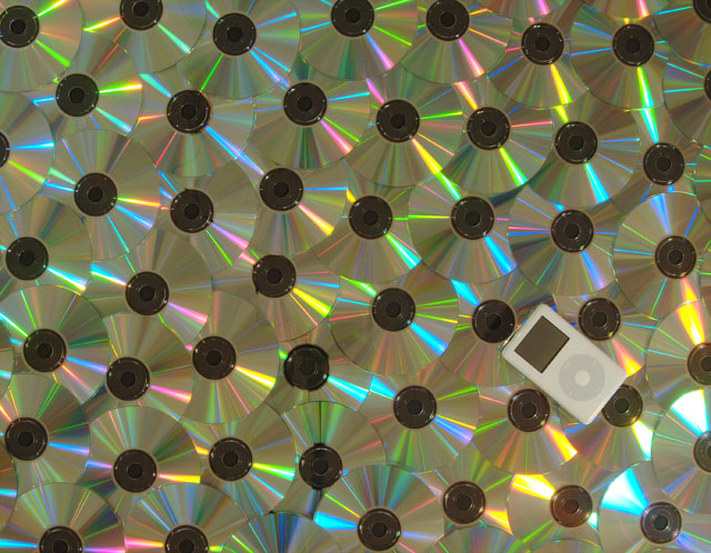
I think you've got the right idea here, the idea of repetition and then the object that's different as the subject. I wanted the iPod to pop a bit more, it's a little small and a little dull looking (did you try it with the screen on?)
great idea, i would maybe have put the camera directly above the ipod so the cd's fall away to the left, my eye keeps getting drawn to the left, and that may have helped keep the focus more on the ipod.
Very good setup and composition. I think this image would look even better with a darker black point and a lighter white point to increase the overall brightness and the richness of the colors, but it still looks really nice as is.
I love the uniqueness of this photo. Stands out from the rest of the pack. I like the concept and the color/reflected light. Would have score higher if the cd's/dvd's had overlapped a bit more, eliminating the center holes - they distract from the little player.
Great idea, interesting way to take minimalism literally, but I find the CDs a little distracting... Perhaps if you somehow managed to have the iPod in the foreground but leave the CDs in the background...out of focus but still discernable.
The background with all the cd's is interesting and colorful but seems much too "busy" for a minimalistic photo. The iPod on a plain background would have been nice, I think.







 Add photograph to your favorites
 Add photographer to your favorites


 Photographer found comment helpful.


