I began the challenge looking at lots and lots of jewelry advertising: Newspapers; Magazines; TV (the home shopping channel); Web; and so on. I studied background (usually white, gradient, or fabric such as velvet), focus and DOF (all over the place), B&W vs. color (all over the place) and in general just trying to get a feel for what’s being done.
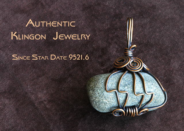
I wanted to do something that would stand out from the crowd. I anticipated many watches, rings, pendants, and earrings with lots of shiny metal and stones. What if I used a plain old rock, instead of a precious or semi-precious stone? My wife makes jewelry and I had a piece she made that fit that goal perfectly.
And I wanted a context that would stand out from the crowd. What culture might value a rock as jewelry? I have always been a huge Star Trek fan and I got to thinking about Klingons. They might wear rock-inspired jewelry. Put it atop a leather background to further the contextual illusion and all that was left was to invent some words that fit the context, modeled after the numerous ads I’d seen.
What you see is the result. To my eye, it’s a decent execution of the idea. I just hope DPC folks have a sense of humor and enough of them resonate with Star Trek so the idea works. Enjoy!
Post Processing
Levels
Clone out Dust & Specs
Crop
Resize
USM
Text
Font: Star Trek Film BT
Enter English Text
Save for Web
Camera Data
Nikon D70
2005/04/22 11:01:02
JPEG (8-bit) Fine
Image Size: Large (3008 x 2000)
Lens: 105mm F/2.8 D
Focal Length: 105mm
Exposure Mode: Aperture Priority
Metering Mode: Center-Weighted
4 sec - F/38
Exposure Comp.: -1.0 EV
Sensitivity: ISO 200
Optimize Image: Vivid
White Balance: Auto
AF Mode: Manual
Flash Sync Mode: Not Attached
Color Mode: Mode IIIa (sRGB)
Tone Comp: Auto
Hue Adjustment: 0°
Saturation: Normal
Sharpening: Auto
Image Comment:
Noise Reduction: Fixed Pattern
Statistics
Place: 28 out of 159 Avg (all users): 6.1968 Avg (commenters): 7.2051 Avg (participants): 6.0400 Avg (non-participants): 6.3020 Views since voting: 1739 Views during voting: 382 Votes: 249 Comments: 42 Favorites: 1 (view)
A very appropiate font to match the subject. Something gives the illusion that the type has a tilt and climbs up to the right. However, this is very minor in consideration of the well composed image. Bumping up.
LOL, well another trekker on DPC, cool. Authentic, that i'd have to see! Cool shot, although there really is nothing 'special' about it unfortunatly. I'd loved to see a very hard 'Klingon Empire' themed setting with the jewel (metal, rust, red, dirty...). 6
Nice! Love the star trek addition. The color saturation in the stone is nice. I like the contrast on the gold? the background is a nice addition also 10
Nice choice of background material. Interesting jewelry piece. Go Trekkies! ;^) No, I'm not one, but I used to watch the show. I think you've balanced this photo and text very well. The lighting and focus is fine too. Good luck in the challenge.
good pic but hate the text. the font is ok, but the placement and sizing is really static and ordinary. i would have asked a graphic design friend to help - or just left it off.
This is creative and unusual, but very good..I like the Klingon jewelry too! The background sets off the stone well, the detail is good on the wire wrapping..it is just plain cool..7





 Add photograph to your favorites
 Add photographer to your favorites


 Photographer found comment helpful.


