This is a very nice image. There really is only one or 2 things I might like to see a bit differently.
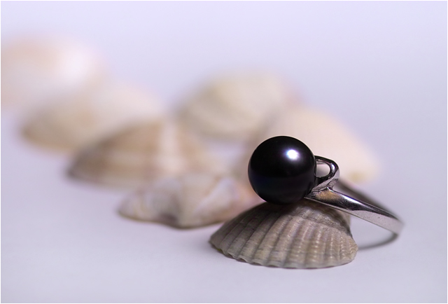
First is the light reflection. The photo is lit wonderfully. No distracting shadows, or blaring hot spots. but the light reflection in the black pearl could be a little smaller in my opinion. I think it's important to have the reflection, it shows that it's a shiny object and without it, i think it might be a bit too plain. But maybe just a little smaller as to not take up so much of the pearl?
The other thing is that I personally would like to see a little bit more of the background in focus. Maybe just the start of the first shell in the background, and then fad it from there.
I love the positioning of the ring and the shells. Very nice set up.
Like I said, lighting is also great. I love the soft feel of the photo.
Color is great as is the focus and clarity.
Overall a great image, one to be proud of for sure and one that I could definately see in an ad. Congrats.
~Heather~
Considering the number of shells in the background, I think a slighty deeper depth of feild would have been more appealing. Perhaps a tighter crop would have yeilded the same effect, though.
Nice soft lighting used and a pretty decent lay-out.
I only wish the depth of field were a little wider so the focus didn't fall away so fast.
Good clarity & detail in the jewelry. (6)
I'm not sure I've actually seen one before : )
I like the presentation a lot; maybe the catchlight could be a bit smaller. I wonder what would happen if you reflected a little light from the left up under the pearl to lighten (not eliminate) the shadow.
There's plenty of room for type; I'm a little surprised you didn't add any to this one, but then I add type to almost anything.
Good idea with shells. A softer light source might have been a better idea, more diffused light would leave less of the reflection on the pearl and improve the overall image. 7.
Stunning photo. From my perspective, this is best of show. It's not perfect (I'm bothered a bit by the focus and losing detail in the front shell) but it is so well composed, colored, leveled and so on that it overcomes the few minor glitches. Congratulations, and well done!
So crisp and well defined! The comp is lacking and I see so much potential if only the shell were larger and flipped so the ring were inside the shell. the angle would show more of the ring. Your skills as a photographer would keep you in our palm pilot.
I like the pearl, the ring looks dirty (maybe that is some dirt reflecting from the background used?). Was this setup near the edge of a table? The silver part of the ring appears to reflect the end of the background - looks like a corner. Sorry to nitpick so much on the ring, but it is the focus of this image. The lighting is good and the focus is fine too. Good luck.






 Add photograph to your favorites
 Add photographer to your favorites

 Photographer found comment helpful.


