I certainly concur with all of the compliments below!
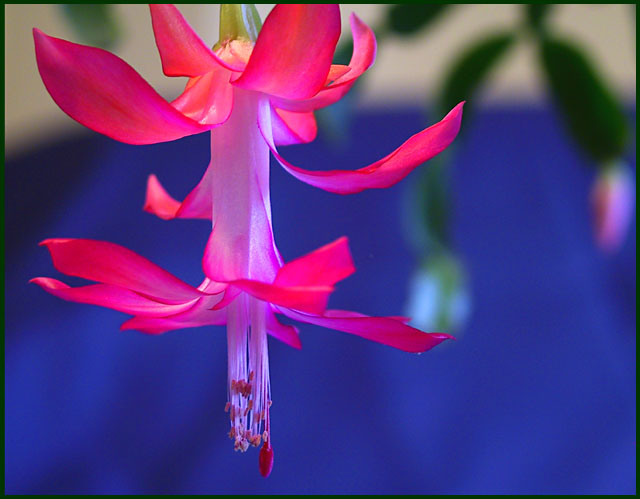
When I gaze at this image ("look" is too weak a word), I am filled with wonder and awe at the beauty of this flower. You've managed to capture its color, sure, but you've given it depth and context as well. The few hanging leaves in the background do a great job at letting us know in a subtle way that this flower was not taken in a laboratory. Well, maybe it was, I don't know, but it doesn't appear to have been, and that's what's important. The soft blue background really sets off the bright hues of the petals, and the lighting marvelously adds a sense of mystique and specialness to the whole affair. I also enjoy the point of view from the side, as it establishes a kind of "just came upon this" kind of feel.
To improve this shot--does it need improving?--you might try continuing the softly mottled blue background all the way up, though I kind of like the break my eyes get from the top section of the image--those "normal" colors really ground the photo in reality. The blue background does seem to have a sharp angle, though, that is just a bit distracting. The stamens may be sharpened a bit with their natural colors (whites and yellows?) coming through. In essence, the whole image may be so colorful that it needs some blahness and neutral tones to further enhance the striking colors that are present and tone down some of that power.
Well, I'm scraping the bottom of the barrell, now! Keep up the good work! I hope to see your work in the future.
Very pretty. How about a vertical crop with more of the stem. Bud is blured so crop it out. If possible the blue should have been the entire background. Christmas cactus?
Damn Damn Damn! I'm not sure how much control you had over this shot, but that flower is PERFECT. I wish the bg was one solid color - a studio shot of some kind - for a flower this beautiful. The colors are amazing and this would truly be one of my faves of the week if the bg wasn't so discombobulated.
I think it could use a bit of light on the bottom. Maybe a reflector under it. I dont like the empty space on the right but I think it makes it more attractive to a buyer that needs space for words. Nice detail, I really like it alot.





 Add photograph to your favorites
 Add photographer to your favorites

 Photographer found comment helpful.


