Author Thread Comments Made During the Challenge
Post actions
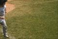
It's hard to really see what that is even, a mouse? Almost looks like clipart as apposed to an actual picture, too minimal for me...sorry.
Post actions
Definately minimalist; however, it always helps if people can determine what the subject is.
Post actions
The subject is a little too small for me to really make out what it is. 4
Post actions
Post actions
Subject is evident, but unfortunately, I can't tell what it is. It could be two or three times larger, and still be very small.
Post actions
I get what you were trying to do, but when the photo is so minimal that I have absolutley no idea what that is in the upper right corner...I think you may have taken the idea too far.
Post actions
A little bit larger perhaps. Maybe a maze in the photo could have provided extra interest.
Post actions
I like this idea but the mouse (?) is taking too little space of the canvas. I am not sure what I would find better but at least double.
Post actions
Is this a duck or a mouse? :-)
Post actions
Post actions
Perfectly fits the challenge, but doesn't speak that much to me.
Post actions
i have a vague feeling that the subject should be at least large enough thatyou can tell what it is...??
Post actions
Post actions
Background is both harsh on the eyes and boring, and the mouse seems out of focus. Making the mouse a little bit larger might have helped.
Post actions
It's a bit difficult to understand what the subject is... To me it looks like a mouse or something hrmm
Post actions
im not sure what the subject really is
Post actions
Although this may meet the challenge, there is no real interesting subject.
Post actions
Post actions
There isn't much in this picture to attract the eye. The subject is dark, and so it's good that you used a light background. But I wonder if yellow or perhaps a light green might have been better. It can be hard to look at what is mostly a blank page.
Post actions
Challenge: 8
Post actions
Fits the challenge quite well, but this just doesn't 'speak' to me. I can't quite make out what the subject is (a kite, I think) because it's out of focus. Also, I'm not quite sure about the subject placement. Perhaps a slightly shorter crop would help draw the eye to the subject.
Post actions
The mouse could have been twice as big to increase the impact, but the image is fully within the bounds. Bumping up.
Post actions
I found the subject a little bit too small
Post actions
Your subject is so small that it is sort of hard to tell what it is, I think it meets the challenge well though, 7
Post actions
very minimal! What is it?
Post actions
Post actions
I can't tell what this is. Sorry
Post actions
Now THAT is what I call minimal.







 Add photograph to your favorites
 Add photographer to your favorites


 Photographer found comment helpful.


