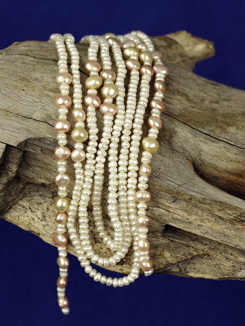
The lighting on this photo is excellent, but the depth of field is a bit too shallow IMO. I can't see any particular reason not to have everything here in sharp focus.
Odd composition but really crisp and well centered. With this comp I don't see room for text placement. A little more blue on the top and bottom would help, You're on the right track.
As something that I have fallen victim to myself, I have to wonder about your background color. In the Wacky Foods challenge, my shot had a bright green background that was probably a mistake. I think the background has a false look to it, and could have been better in a different, less dominate color. I like the wood, but I think a different set up of the pearls could have been more pleasing, say if they were more spread out like vines on a log.
Nice pearls! I like your color choice for the background, it's different and it works. The lighting is ok, I would like to see it toned down just a little. Did you try wetting the wood to darken it...that might have been interesting. Well done overall.
I think this could have really jumped out more if the beads weren't so centered in the frame. The picture needs a little contrast boost too, it would really compliment the wood.
Pairing bleached beach wood with pearls is an inspired choice. I also like the blue background. While I appreciate the rhythm of the pearls assembled in lines, the fact that those lines run parallel with the edge of the photo makes the composition feel more static than it needs to be.
Crop / framing is at odds here with the background showing above and below the wood.
Perhaps a different crop woud have helped this, either cropping off some of the bottom or the top, so the eye doesn't get pulled in two different directions in my opinion.
not quite sure what to say about this shot. Lighting is stale, composition is off, DOF is not strong enought for the effect you want to give. Blue background doesn't compliment the colours of the jewel at all. The wood on the other hand is very cool, but could've used a lot more contrast and some colour adjustments to the whole picture could've punched this pic some. Sorry. 4
To my liking, the necklace should be draped at a bit of an angle, rather than straight up and down. I like your choice of backdrop - the wood - , the lighting and the DOF. 6
Very nice photo and I gave it a good score. Two things would improve it in my opinion: 1) DOF is such that you're losing focus on the edges of the pearls. It may be just my predjudice but I think having all the pearls with the DOF limits would improve it slightly. 2) The background appears to be a single monochrome color. I believe it would add interest if there was some variation in the background. Not something to go crazy with but something subtle. Neither of these are a big deal, just slight improvement at the margin. Good luck.






 Add photograph to your favorites
 Add photographer to your favorites

 Photographer found comment helpful.


