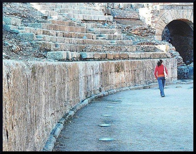
This looks like it's been processed to death. If it starts out so fuzzy that it takes this much USM to make it sharp you might be better off trying to make the blur look intentional / artistic. The colors look rather washed-out / overexposed / under-saturated. I think that the composition in general is good; all of the elements seem to direct my attention to the stone arch on the right. Had the rules allowed it, giving that some kind of special treatment in post-processing (making it pitch black to add an air of mystery, etc.) would have enhanced the image.
There's something odd in the rendering of this image--oversharpened, perhaps. I like grain in an image (though many don't) but this is something other than "grain" I think. The subject is o.k. but she is at an odd point in her step, feels as if she's about to tip over. Sorry if you find this harsh, just trying to be honest.
very nice composition with the sweeping wall and circular things on the ground. the colors are interesting. i think it is a bit oversharpened for most peoples tastes but it doesn't bother me any.
lots of contrast here, nice idea, i found my eyes wandering a little too much though.. but in saying that, they do go straight to the girl right away, which i'm presuming is your 'minimal' subject ? then they wander.. 6
I think the subject is great and the composition is good. However, it looks like it has been oversharpened and the graininess it created is not compelling.
I don't think this fits the challenge. Maybe if you had titled it to make the viewer think the girl is the subject, it would work better. Too grainy or something. Looks like some kind of texture filter was applied to the image.






 Add photograph to your favorites
 Add photographer to your favorites


 Photographer found comment helpful.


