You got a lot of useful comments on this shot. Don't be afraid to check the 'useful' button to let the commenters know their time spent was appreciated.
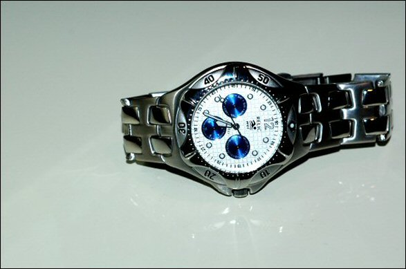
To be perfectly honest about this shot, it looks like you threw the watch on the table, took one shot, resized it and submitted. If you were the makers of this watch, would you buy this photo to advertise it?
The focus is soft, I cannot even read who makes the watch. The reflection might have been neat had it been a reflection of the entire watch, but it just looks like reflection from the light source.
Flash doesn't seem to me to be the best choice for lighting in an advertisment.
The background does not help to accentuate your subject either. There is a blue grey tint to it that takes away from the watch in my opinion.
The angle and framing also do not seem to increase interest in the watch. Maybe setting the watch upright so we could read the hands in normal position, or centering it a bit more, I think would add some visual appeal.
The one comment you received that I do not agree with in your case is the comment about setting the hands at 10 and 2. This only works if the watch manufacturer name is UNDER the center. If your watch were set at 10:10, the hands would be covering up the logo, and it would be pointless.
That being said, the other popular time for watches with the logo above the center (like yours) is 8:20. But again, I think that only works when the watch is upright.
~Heather~
Nice watch. I think it might have worked a little better if the watch was flipped though. With the set knob facing up. Also, the background gives it an "off" coloring.
Lighting is harsh and uncontroled, reflection is quite weak and doesn't seem planned. Time displayed is not flattering for the watch make. Composition is boring. no background doesn't help. Keep at it. 4
Plain and simpe, good detail on the watch. not the best choice for background, the faint reflections distract rather than enhance the subect. Think the composition could be better as well.
The lighting is a little shy giving way to some loss of detail. When placed on a reflective surface your lighting task mounts in difficulty. The composition is nice and hence the bump.
I like the reflection, but it might have been more captivating on pure white (I think it just is giving off a greyish cast). Also a little closer in to the watch might have added to clarity.
position is not good. and the lighting could have been better. If you are getting to many glares from the ring then try a piece of paper to blanche the glare while still giving the good lighting. 5
The lighting is a little much. The glare on the "background" surface is distracting as is the glare on the watch itself. The color of the background does nothing to enhance the watch... I think it actually makes it look more dull. Keep up the good work!
Rotating the watch would have make the composition better. Seems that direct lighting was used which blow out detail on the dial and creates dark area like right side wrist band.
The off-centering looks like an accident. Maybe if the spacing above and below were a little tighter. The lighting is a bit harsh...looks like a flash was used almost (I know it wasn't...). Nice watch. Good luck.
Pretty good choice of subject. The straight-on lighting casts harsh shadows. The composition is static, would have been better with left end cropped. Watch is just a little too far away and too unsharp. I want not only to be able to read the brand name, but the little lables in the blue dials. Not finding a compelling reason for the watch to be set on its side. If it is to be horizontal, it would seem a little neater if it were exactly horizontal. Hope some of these suggestions are helpful.
I believe the watch is on glass and the reflection is distracting. The watch is not displayed straight (not that this matters) . Not sure about the shadows on the right side (band).
Okay I think you have a good looking watch for this shoot..but it's just a little too static to POP for an advertizement. Maybe try shooting on a non-reflective surface.
Most watches should be in a vertical compsoition, or an angle at best. The horizontal arrangement here doesn't work too well, as the viewer feels the need to tilt their head to read the words/text on the watch face.
Nice colour, good focus, good Dof. The only negative I see is IMO, I would have reversed this image, so that the twelve as on the left. That way it would seem like the watch was point up, instead of down.





 Add photograph to your favorites
 Add photographer to your favorites


