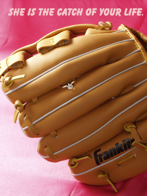
My first impression was "Franklin" brand jewelry?? Which, we all know that Franklin is the brand name of the glove. This would not hold up in a true jewelry ad, since it seems more of an ad for the glove. However, I tried a crop on this just above the word franklin and not only does it eliminate the ball glove ad, it also draws our attention up toward the ring, which, as is, is very small and currently not the main focal point in my opinion.
The lighting appears to be nice. It starts to get just a little bit bright on the glove to the far left, but it's not serious and does not affect the overall photo.
Focus and clarity are really good. I like the detail we get in the glove.
The background is a bit of a distraction. While I personally like the color and the gradient look, there is a crease up near the words, and a seam in the bottom part of the background. That seam would also be eliminated with a crop just above the logo on the glove.
Overall, this is a nice shot to look at, and technically well done, but needs to have a bit more attention on the ring.
~Heather~
Nice take on the photo. Its to bad you couldn't get this impression across and also have the ring be a larger portion of the photo. I'm not sure how you could have done it though. but I like this. 9
Not sure what to say about this shot... the idea is very fun and unique, although i'm not certian it would fair well in an advertisement. Unfortunatly, we don't really 'see' the ring, nor its actual Jewel... so there isn't much to do here. Lighting is ok (Natural?) but the hangle is wierd. Perharps trying to use a reflector (white foam) on the right side to throw a little more light on to the glove could help in making the Diamond shine some... 5
Nice concept, but closer to the ring would have shown more detail of it. The composition you choose looks like you wanted to take a picture of a baseball glove. Light a bit too strong on top of the glove.
Love the idea, but would have loved to have seen the mitt the other way up 'catching' the diamond. Also feel that because of the size differences the ring tends to get a little lost in the glove.......not sure how this could be overcome though.
Clever idea, but the ring seems to get kinda' lost in the image. The glove is just taking control here. Perhaps a tigher crop may have helped. Pink background is a bit distracting in my opinion. If it were more subdued more, it possibly would have softened it a little.
Did you try this with different fonts? Needs a feminine feel. (6)
I'm not sure about the pink color (might be just me) and the bright area on the left is a tad bit distracting. The lettering probably would have been better if they were completely white (again, just me). Would be interesting to see whether or not the reverse (ring on the palm of the glove) is better. In any case, overall, a wonderful layout and an attention-getter! Excellent job, this would do very well as an advertisement.
what a great great idea...the only issue i have and remember this is my opinion is that unfortunatly the ring is lost in the vastness of the mitt...actually anything but the hope diamond would have the same problem....good luck :)
Good idea. Well done. The only issue I have is this is a jewelry advertisement and I believe if used, only baseball players would look at the ad. My opinion. The quality of the photo is very well done.
cute concept. good lighting - one of the few diamonds that actually shine. A suggestion - I don't think the pink background works in this. Perhaps a flat black, and avoiding a seam ? fold? in the foreground.
I think the ring is too small for the advertisement. I can't see what I'm buying. I can only guess - if this were an accompanying image to a larger macro of the ring, it would make more sense. 5.





 Add photograph to your favorites
 Add photographer to your favorites

 Photographer found comment helpful.


