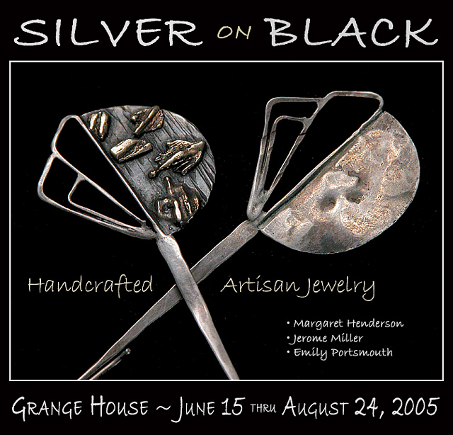
I really like seeing the texture on the "inside" part; good exposure overall. Type works OK, although I like to make it a little bolder when reversing out of a black background; if this were printed in a magazine or (worse) a newspaper, that type could possibly plug up and be less readable -- it looks fine on the screen though.
Excellent use of text in the challenge! This looks ready to be published in a magazine! Jewelry while not as catchy as diamonds and other gems, it still compelling and interesting to look at.
One of the criteria I used in my voting is whether or not I could imagine the photo in an ad in a magazine I might pick up. This certainly meets the test. The photo of the jewelry isn't the best in the challenge (don't take offense, it's plenty good enough) but what really sets your entry off is the integration of photo and text. I really can imagine it in a magazine ad. Well Done! Among my top picks.
Nice subtle light on the jewelry, and I like your choice of those unique, unusual pieces. Your choice of font matches the feel of the jewelry, too. Very nice! 9
I like the way you framed the photo with the white border leaving room for text outside the box. This looks good. I have no idea what type of jewelry this is. They actually look like letter openers, and the way they are positioned almost look like scissors (ahhhh, not more scissors!!!). ;^) Good luck.
This is great. I like the balance. The text is great for an add, this picture is good enough to just have a single word being the designers name or company.
You've done this before. very, very nice. Nice comp, nice font, nice colors. I would of liked to see the complete pieces that seemed a little cropped. (Is this a real event?)
Wierd suggestion of composition. I feel overwhelmed with information which in an advertisement picture, isn't too good (leave that for the part where there is actual text in a magazine for exemple). Lighting is a little stale, but works with the contrast work. LOts of touchups could've avoid all the little grains and grey spots all around the item. The change in colours of the text is not very appealing either. 5
At first, I wanted to vote this down, as I didn't think it belonged in a magazine, then realized who said anything about a magazine only? (duh - me!)
This is a good example of an advertisement, as would be seen in a poster or similar, and is very effectively done.
Al the text is killing this excellent photo 9-10 without all this text 8 as it is, sorry
It is just the text inside the frame.
I hope I have time to look at this on again
Composition: Excellent! your choices on placement are well thought out
Lighting: Excellent - no glares no hot spots
Color: excellent
Clarity: Nice and sharp!
This looks like an advertising that I would see in magazine and newspapers
don't like the "on" being different color even though it matches colors in jewelry...changing color to fond detracts...overall..lovely and nice photographic techniques...9







 Add photograph to your favorites
 Add photographer to your favorites

 Photographer found comment helpful.


