This is indeed a very nice approach. It leaves the minor question whether the tones in the stones could have been exploited more. Not to worry, the composition and idea are extremely well. Bumping up.
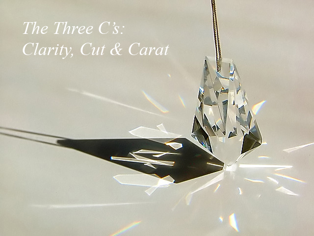
WOW, I love the prism effect. I think it would have worked even better on a darker background. I could be wrong though. Only other thing is the jewel is not coming straight down. it's at an angle and it slightly distracting.
WOW ! Shadow, crispness and the basic-ness of the shot works so well. I can see this up there at the top, I would have liked to see the BG or surface area with a slight blue tint to reflect a little colour into the stone but thats simply preference.
Great ad. The message is clear and direct. I like that. The photo isn't what I'd recommend. Lose the shadow. (but that might cost the reflection that I believe could be really cool.) A small stroke on the text would make it stand out more
Brilliant shot, excellent composition & creative idea, really stands out from the crowd, I think the text complements the image nicely. Well though-out.
A rather abstract composition using the shadows & light to your advantage.
A little on the harsh side in my opinion and it may have helped to bring the brightess down a tad.
There is a number of things I really like about this image: the simplicity, the composition, the lighting - the dark shadow versus the prism lights is great.
The thing I don't like is the background. If it was a slightly darker color, it would show off the lights better, plus it would give more contrast for the stone itself. 9





 Add photograph to your favorites
 Add photographer to your favorites

 Photographer found comment helpful.


