Is this suposed to say "Brilliant even when they AREN'T"?? As it is, it doesn't reall make much sense.
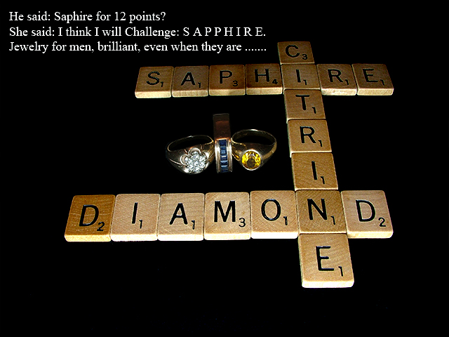
Anyway, the jewelry is small and dark in comparrison to the rest of the photo. The tiles are lit ok, but the jewelry kind of dissapears into the background. I like that the tiles get darker as they go into the photo. This creates depth. The lighting is slightly too bright on the front side of the tiles toward the bottom of the photo.
Focus seems ok, but hard to tell on the jewelry since we can't really see much of the jewelry.
The writing does seem like a bit too much. If I were driving and saw this on a bilboard or something, I definately would not have time to read the words AND find the rings. In a magazine, you'd have a better chance of people being able to read it, but still I'd like to see something simpler.
Had the rings been easier to see in the photo, I'm not so sure I like them in the dead center of the shot. Seems too forced to me.
The idea is good, but would like to see this set up differently to better show the rings and maybe give a little visual appeal.
~Heather~
This is creative and you obviously put some thought into this!
Unfortunately for me the shot doesn't show off the jewelry enough to make it an effective ad... if you had moved the jewelry to the foreground it may have worked better overall.
Funny! Unfortunatly, I'm not sure how this would work in an Advertisement. Colours are interesting but could've been punched a little more. Lighting in itself is uneven and makes it hard to reflect the 'beauty' of the jewels, especially since they take about 10% of the shot. Text is plain and doesn't bring anything special, just tries to help or explain the display., 5
I needed to read the letters and the caption more than once, and then I turned my attention to the jewelry. I feel the jewelry must still be front and center. Originality is very high here.
I think your intention here was good, but ended up being way too busy, with the jewelry being too small for the shot. Text portion is too wordy here also in my opinion.
Great concept! I don't know if I understand it completely. The lighting is a little off and I think your tag lines would work better on radio or TV. Believe me: This is a big complement! Nice comp with the photo but the text needs different placement , possibly font.
I've used scrabble pieces in real ads despite my legal department telling me not too, as the tiles themselves are trademarked... so in real life you would have atleast had to Photoshop the numbers on the tiles out...
Cute, but where's the jewelry? Oh, I see it...in the middle. ;^) I like your idea, the lighting is ok (bit dark towards the top) - but I really think the jewelry needed more impact. Good luck.






 Add photograph to your favorites
 Add photographer to your favorites


 Photographer found comment helpful.


