Thanks to all the commenters -- a new record for me. I appreciate your suggestions and was delighted to see you collectively liked what I liked and the same with the dislikes. I'm so tickled to be on the first page :))
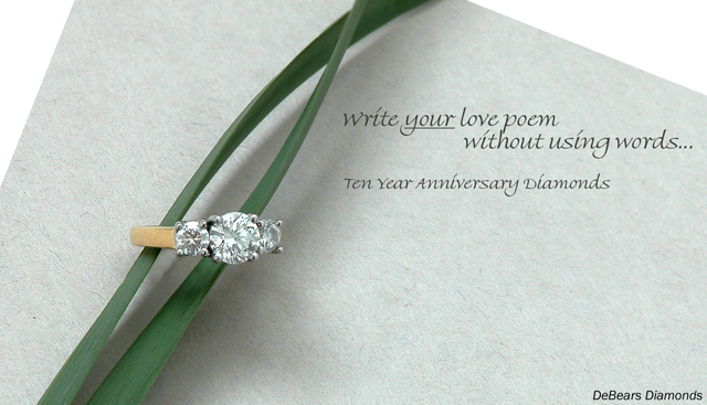
Very nice composition and typography. You've done a great job capturing sparkle in the diamonds without going nuts with diffraction spikes. Having the ring face the camera so perpendicularly seems to flatten it though. This is an awesome layout. (8)
Nice set-up and composition. I don't think the company name is necessary, but I do like the text and font in the main message. The green ribbon is a nice choice as it stands out well, but is not too overpowering.
Unique idea and beautifully executed. The ring looks a little off center to me and I would have turned it to the right a little more to show more symmetry. I like the type style and copy and I could see this image in a magazine
very nice composition - well done :)
I feel that there is a little room for impovement on the lighting but not sure exactly what, I'd suggest posting this in a thread after the challenge
Very well presented with a very nice layout, nice subtle colors. Excellent choice for font to fit the mood...I do find the first two lines a little crowded but doesn't detract from the shot too much. Excellent job.
Very simple and elegant, earth tone colours add that warm feel. Text is perfect, almost looks like it's written on the paper. Wouldn't change a thing about this picture
De Bears, huh. :) This is one of my higher choices. Excellent composition and coloring. Not quite as "focused" on the diamonds as I would like, personally. 9
Very nice soft lighting (used a soft box or natural?) The text is very subtle and brilliant, the CO. name is very shy and perfect for the look. Colours are nice and the jewel really is nice. 2 things i really don't like tho, is the reflection on the ring (orange) which to my eyes, doesn't fit at all with the restof the picture, and the paper on which the ring rests. The white borders kind of breaks the pattern for me. Also, perharps a little more energy in the colours would've helped. Very nice work! 7
Cool props for your composition, it balances nicely. This would have really popped with a navy or black background behind the paper IMO. Good lighting on the ring (very nice diamond by the way...). Good luck in the challenge.
Elegant design & layout.
The green is a nice touch in this image, and the text used on your ad is very feminine and complimetary. Focal point is good and the detail & lighting are very good.
Well Done - one of my favorites in this challenge! (10)
Sophisticated approach but high key style diminishes impact of stone imho. Good attempt overall. PS is it DeBeers? Or is this clue to the photographer?!
very well done, a favorite of mine for this challenge. no detail lost, and capturing the detail of a diamond stone is very hard. (I know because I was not very successful at it) Great work 10. IMHO it should ribbon
I think I know who this is.... Nice job. Great Idea but I'd like to see the ring and text presented better ( larger for sure and perhaps the diamond could be better centered showing gold on both sides of it.) Needs larger more pronounced text.
I like the soft diffuse lighting and the message is great. While the white space in the top corners, representing a white backdrop, are not necessarily distracting, perhaps a different backdrop could have been more effective, like a more subtle shade, or a textured surface like wood. Overall a fantastic entry! 8
Composition: Excelletn!!
Lighting: would like to see this lit a little better, the diamond looks white instead of sparkly and clear
Color: good
Clarity: extremely clear!!
Lettering: fits advert extremely well
What a wonderful and creative idea for your photo! Color, comp, DOF, lighting ... all well done. Text works, Font works., nice and light and doesn't overpower the ring. It may be an intentional misspelling, but it's DeBeers. DeBears is a Chicago football team.
Outstanding - one of the top few, I think. Also, one of the few where the text actually compliments the image. My only suggestions would be to get just a bit more sparkle in the diamonds.
nice sharp focusing. great framing. this is one of my top scores for the challenge. great lighting. nice background. only problem is....I cant criticise it!







 Add photograph to your favorites
 Add photographer to your favorites

 Photographer found comment helpful.


