Hey!
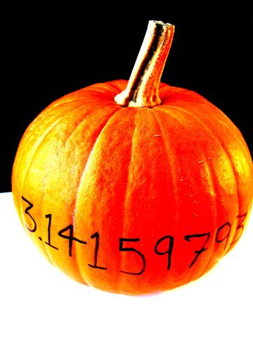
I like the colors! I almost thought this was another color shot.
The black and white really make the orange standout. However, I think there might be a little too much contrast. I think that the color alone would be enough to make the pumpkin "pop" without making it quite so bright. I don't think the lighting was bad... it's just too much contrast. I also think it would be better to have an even amount of space on either side of the pumpkin. It's a bit weird that the right side is cropped.
Cute picture. Good idea. Just a few technical glitches. Still, a score above 5 aint bad!





 Add photograph to your favorites
 Add photographer to your favorites


