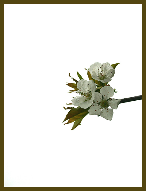
The color of the frame is a little distracting. Maybe it is my monitor, but the cherry blossoms look a little flat. With the white background my eye wants to see a little more contrast in the subject. 7
One of the few borders in this challenge that really enhances the shot. Nice choice. There's good detail on the subject, but I would be curious to see how it would come out on an ivory background as opposed to stark white. The only thing with the whiite is that it can be hard to look at, though I think that it works better with this shot than with others.
I have no opinion one way or the other about borders: as you might see, I border all my own presentations here. This one, however, contrasting so very strongly with the image, is not to be ignored, and I can't see that it complements rather than fighting with this shot - especially using a colour selected out of the image itself, which serves in my mind only to strengthen the connection between the image and the border, and this to re-emphasise the border itself. In many ways it serves, to my eye, only to relgeate those flowers to a secondary subject of the presentation: the thing that one's eye is constantly pulled to is ... well, you know where I'm going.
This is really beautiful. I love the copper color tones you used in your border to accent and compliment your cherry blossom. It's a great minimalist picture. 10






 Add photograph to your favorites
 Add photographer to your favorites


 Photographer found comment helpful.


