Very nice capture. I like the simplicity of this image. I think it fits the challenge very well.
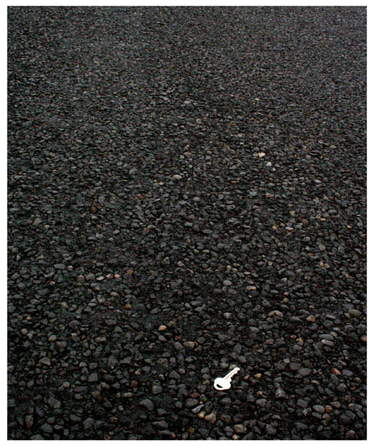
The focus seems really good on the rocks, but the key appears a bit soft. I'm wondering if it's due to the lighting reflecting off the key.
The key also seems a bit too bright, which is why I'm led to believe that the brightness is affecting the appearance of the focus on the key.
I like the placement of the key within the frame of the photo. very nice use of negative space.
Color is really good.I like how there are little red speckels throughout the photo in the rocks. that adds a bit of interest in the rocks without taking away from the key.
The simple border works well here. I wonder what it would look like against a black border. Would that make the key appear brighter, or maybe tone it down a bit?
Overall a very nice image, that I find highly visually appealing and could only benefit from different lighting on the key in my opinion.
~Heather~
Your subject, the key, needs to be a bit more crisply in focus and perhaps not so blown out on the highlights. The title is a little too cutesy to carry its purported ntent.
I like the concept of this picture, but I think it would have been a little more effective with a more overhead view, so that the light was evenly dispersed and you could see more detail in the key. Very creative though.
Well it is difficult to catch metal outside in good coloring, this is a good idea but not workint out totally for me. Bit more dark and having the key a bit more to the right would be better. I think it is important that the key is very clear and a contrast although just the outlines of it.
What a fascinatingly strange image! Not only is the content bizaare but there is also some strange feeling of the ground being at an angle which puts me off balance. Compositionally too the image succeeds at putting the viewer off-kilter as the key sits neither on a third line nor centred but in a position refreshingly out of the ordinary. Sharpness of focus on the key itself could be better but... altogether a very interesting image!
The key seems to be too far near the edge of the photo. I normally do not consider the rule of 3rds to be ubiquitous, but in this case I think that the key does belong somewhere in the golden ratio area - with its current orientation, it could go a bit to the left and a bit more towards the top.
Also the light parts of the key looks overblown.
I had a simlar idea I wanted to pull off with a feather instead of a key but I never go around to take the time to pull it off and I didn´t know an area with black sand or stones so I didn´t enter. Anyway, I like this, it´s technically very well done and I gave it a 7.
The main object is the only thing with no real details. The colors and textures in the stone pavement are beautiful, but your main object leaves me unexcited. <5>
Cool concept. I would have placed the key a little higher in the image to meet the rule of thirds. I also would have placed something else at the top of the image (maybe a set of keys, a set of keyrings, a pile of keyrings, etc.) to try to give the image a little more concrete meaning. The key by itself is too abstract for me.






 Add photograph to your favorites
 Add photographer to your favorites


