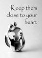
Monastiraki is a touristy if not unique area in Athens which houses many jewelry stores that would sell jewelry just like this. I have never attempted anything like this, so hopefully I am on the the right track. My DOF and jewelry store like plush background I think helped a lot. Thanks for your votes and views.
Cropped
Rotated
Levels
Curves
Dodge/Burn silver and background
Resize
Unsharp Mask
Add text
Border
Statistics
Place: 63 out of 159 Avg (all users): 5.5967 Avg (commenters): 5.5789 Avg (participants): 5.3500 Avg (non-participants): 5.7692 Views since voting: 1274 Views during voting: 366 Votes: 243 Comments: 23 Favorites: 0
This appears to be shot at quite an angle. the foreground, (assumed right side) is noticeably blurred. Think it would have been better at less of an angle to keep focus sharp.
....or good enough for the British Museum! Good approach although I might have been tempted to bring the focus a little closer to include the right hand end of the chain.
The words seem more important than the bracelet. The bracelet would work much better if it was all in focus, the depth of field is way too low in this picture.
Very nice composition. Excellent colors and textures. i wish the DOF was not so narrow, but that's just my personal taste. nice selection of jewel. font seems to work here, which cannot be said about most of the entries inthis challenge. On of my top 10. Cheers!
Interesting choice of verbiage. Nice background choice for this piece of jewelry. Good composition with positioning of the necklace and text. Not sure about the choice of text for the jewelers name...hard to read. Good luck in the challenge.
Focal point pulls me all over this shot, right & left.
Not sure what to suggest to better it though.
I like the way the text falls in the highlighted area.
I love the tag line and the composition. I'd ask for a little more DOF on the photo and the rule of putting a Company name in it is that it should be obvious who the company is. I don't get that here. I'd request that it were more pronounced. You could make it bigger and change the font. A small stroke would help.
not sure if I think slogan helps or seems like one is just satisfied and not deserving? gl with challenge...shot is nice...tad much fade in lower right corner...







 Add photograph to your favorites
 Add photographer to your favorites


 Photographer found comment helpful.


