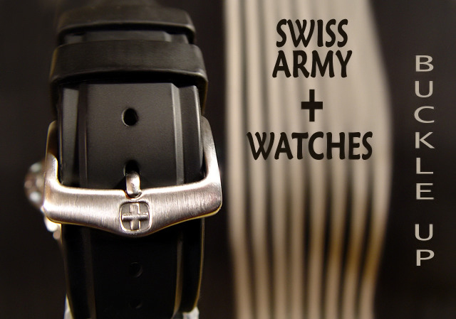
My watch, taped to my flash extension arm abut 2" from the lens. Shot while moving the camera in front of a striped place mat to get some motion blur. Post: cropped, some flaws in the watch and band cloned out, resized, the BradP 3 USM technique, text added, neat imaged and SFW.
Statistics
Place: 42 out of 159 Avg (all users): 5.9212 Avg (commenters): 6.6400 Avg (participants): 5.7647 Avg (non-participants): 6.0360 Views since voting: 1049 Views during voting: 382 Votes: 241 Comments: 29 Favorites: 0
General: The tones are very pleasing and focus is on the brightest part of the image which is what draws the viewers attention.
Composition: The position of the watch itself seems to work however the image as a whole feels out of balance. This could be due to the sections of the image being of different widths and different intensities. It feels weighted a bit too much on the left. Removing the 'Buckle Up' text or changing its location may help. Also, the other text may help balance the image a bit if it were a bit lower in the frame.
Exposure: There are some areas of overexposure, on the buckle and in the background. However these areas are not large enough to present too much of a distraction. Changing the angle of view may have helped here.
Impact: Some impact is created by the tones used and the sharp focus. However, the misplacement of the text takes away from the impact of the other elements.
One of a kind in this challenge.
The overall non-dead center composition is good, though the text is taking away from it inmy opinion. Perhaps not having the "Swiss Army + Watches" in it would have been better, as this shot makes me think belt buckle, as there is no watch visible. (5)
Love it! bumping up again! Can't seem to say anything for improvement other than if there was a way you could have made the head of the watch not be in the photo it may have been less distracting - but the blurred bacground behind the font helps this balance! Great work! 9
Unusual idea to sell a watch by the buckle.... my guess is that it wouldn't be effective advertising. The image presented is very well done and I think you could have used the watch face under the writing rather than the lined thing.
i would have prefered if the "swiss army + watches" was done in a style similar to the "buckle up" part. I dont think they dont go well together in one design. The photo itself is ok.
This is interesting. I wish you hadn't used two font styles for your text. The watchband has character with the buckle and I can understand why you did this. Looks like the band is not quite straight up and down...
Interesting idea showing the back of the watch. It is eye catching, but I don't know how it sells the product. what is the striped thing behind the words? keep it simple!
Definitely clever, but the pure verticals don't seem to work well. Diagonals seem much more powerful. This feels static and segmented. Just my opinion, not trying to insult. :)
Quite unique idea i must say. It feels wierd because i've done some test shots of exactly the same idea, but decided against it. My main concern in this shot is the fact that we don,t actually see the product. Its like if you are selling the wrist band instead of the actual watch(?!). Lighting is very good and simply ad i like the DOF. (what's on the right??) Text is interesting. Because of the band's angle, i feel like the whole picture goes sideways, which is a bit disturbing. 6
Composition: Good
Lighting: looks very nice
Color: very nice
Clarity: extremely
Lettering: the two different fonts are distracting. I like the use of the swiss army + in the wording.






 Add photograph to your favorites
 Add photographer to your favorites

 Photographer found comment helpful.


