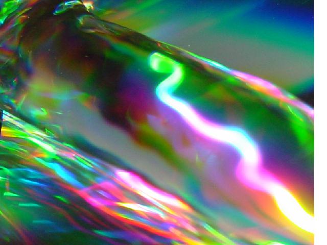
Composition - Very nice colors in this image. I like it as an abstract piece for the most part. I'd have cropped it tighter so the space on the top right wasn't so vast. The corner to corner framing works very well for this piece and gives it a nice dynamic flow. Because its more of an abstract piece, I have a hard time saying too much about it except for I think its pretty cool.
Technical - Since I have no idea how you did this, I don't really know what to say. I am interested to know though, so you could fill me in any time. I will say that it looks like the area around the light stream is a little pixelated. I don't know if thats from resolution or just the way it worked out, but I don't necessarily think its a bad thing either.
Overall - Your score is not a reflection of the quality of this pic but I think more of a reflection of the criteria the DPC crowd looks for. I think its a fine picture for the most part. I'll leave it at that and bid you good luck in upcoming challenges - Inspzil
I think this is a nice and interesting image, but am confused as to why you left the white space on the right. I think this would look very nice cropped to the image. Presentation is important, otherwise I would have scored this higher - 5 - Mav
With a little better arrangement this would be a great abstract piece. I don't like the top right corner much but I do like the corner to corner configuration
nice, unique photo.. Like it! Do NOT like the white border on the right of the photo. You need to download and learn how to use PaintShop Pro. Good luck.. 7





 Add photograph to your favorites
 Add photographer to your favorites


 Photographer found comment helpful.


