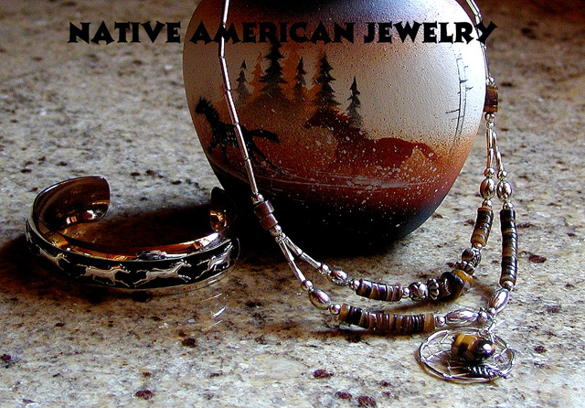
Silver jewelry from Native Americans of Utah...the handmade jar was used as a backdrop with an overhead light and some natural light from a window; setup was on a granite slab. The photo was cropped, sharpened, curves for color with an increase in luminosity.
Statistics
Place: 70 out of 159 Avg (all users): 5.5317 Avg (commenters): 5.9706 Avg (participants): 5.3800 Avg (non-participants): 5.6316 Views since voting: 1169 Views during voting: 411 Votes: 252 Comments: 38 Favorites: 0
Thank you for all the kind comments and good votes! I have a little story associated with the text in this photo..I know it blended and sort of disappeared into the vase but the thing is: I had the flu really bad when I set this up and by the time I was ready to add text, it really didn't matter to me what it was: I just wanted to get into bed and get back to being sick..lol...but I still tried to do a decent shot.
Interesting idea. Composition is rather weaks, i feel it cuts away from the mood of the shot by 'cutting' the bowl the jewels stand on. Lighting is not very effective either, especially on the bracelet on the left. Nice sharpness tho. Keep at it! 6
Overall a nice photo, but the scene on the vase actually captured my eye more that the jewelry, the marble background is also too busy for the jewelry to really "pop" at the viewer. 5
Interesting composition.
Top of frame/image is a bit on the dark side, as is the side of the egg/rock. Dual light sources would have been a big help here.
Text/font used is way too dark and almost the whole word American gets kinda' lost.
Perhaps a black horizonatl border across the top with a less bold white text in it may mave looked better in this case.
I like this type of jewelry because it is very common here at home. I think the shadow detracts from the braclet though and the text is hidden in the darkness of the photo.
I find that the text gets lost in the image. Perhaps using a different colour, or maybe moving to be along the bottom, with bit looser crop would help. Otherwise an excellent image - 8
Nice subject. Floor a little distracting. Cannot stand your font!! And cannot read half of it - you needed another colour font, I think, maybe dark red, to stand out from the pot. Feels as though you are wasing some space, too: tope LHS and RHS are empty.





 Add photograph to your favorites
 Add photographer to your favorites


 Photographer found comment helpful.


