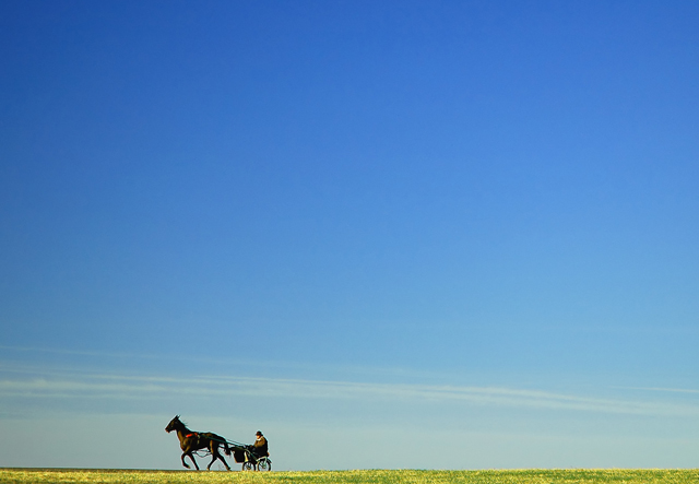
I have been wanting to take this shot for weeks. I drive by this Harness Training Center every morning to work and when I saw this challenge, I thought it would be perfect. We'll see...
First time using PSCS (no ideal what I am doing) <:op
I agree with most, this should have been in the top 10 especially if your main elements were placed to the right with more space for them to trot into. A vertical crop may also work. But it's just gorgeous. The three's and below scores are just mean, I think.
you work great, it's a good shot but I'd prefer to have more space in front of the subject moving direction instead of the back. I think it will give more balance at the shot. bye
Sometimes, the setting is out of our control -- and especially when it's person "A" looking at a photo taken by person "B". I wasn't there and haven't a clue what's ahead of or behind your subject(s). I can *wish* there were more room on the left and less room on the right, but alas, it's just as I see it here and as I see it, it's strikingly well presented. Perhaps just a little sharper than some might like but size restrictions do play a part here as well. Good luck with this ... it's well deserved.
would have prefered the horse and rider on the right hand side of the photo bcos your eye wants to follow the direction they are moving in and right now your eye just gets to the edge of the photo when it does so. but nice shot. 8
A nice tribute to "cowspace" that was in negative space a while ago and one of the favorites on the site. Anyway, needs something more to make me gaze in wonderment but it´s very nice and I gave it a 7, I especially like the offbeat composition and the way that he is heading out of the frame instead of into the frame as is the "rule".
Really like this one, obviously the negative space is great, but for me it's the 'expression' of the horse - at the moment you captured it, it really looks like the horse is straining to drag the guy along
My eyes went immediately went to horse and cart and flowered field.. Great job. The subject is very small, yet shows a fair amount of detail. I gotta go a ten here!
While this image is simple and beautiful and well placed, there is something missing for me. Maybe if he was on the right side of the image, this would be resolved. I don't know. The detail at a distance is captured well. I have no emotional attachment to the image, but that is a personal thing - can't reach everyone! 9 from me!
Beautiful scene. Can't make any worthwhile commentary because I wouldn't change a thing. Top marks from me! Well, maybe I'd rather see the subject placed in the right portion of the frame instead of left because of the direction in which he's moving, but that's it.





 Add photograph to your favorites
 Add photographer to your favorites


 Photographer found comment helpful.


