Autolevels used, it changed little though.
Increased saturation.
Used unsharpen mask.
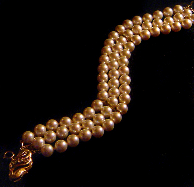
Used burn on the background and healing brush on some spots on the pearls.
Statistics
Place: 118 out of 159 Avg (all users): 5.0680 Avg (commenters): 5.4400 Avg (participants): 4.8317 Avg (non-participants): 5.2282 Views since voting: 838 Views during voting: 338 Votes: 250 Comments: 27 Favorites: 0
Thank you for entering the DPChallenge, Jewelry Advertisment.
Great idea showing the pearl jewelry in a serpentine pattern. The overall design is very interesting. A piece of jewelry that will be notice by everyone. The tree rows of pearls on the subject draws the eye to the front and back of the jewelry.
I wonder if you could have fit the entire piece on the frame. The rear portion of the jewelry is out of sight. The head of the piece is a bit blurry, or out of focus.
The gold light bouncing off the pearls makes it attractive. However the overall tone of the image is dark. There seems to be area's in the photo that need some highlights, in order to show more details. There is also some grain/noise on the pearls themselves. This could be from an understated light source. Or even from the light shine projected on them. Wondering if you had re position the jewelry in the opposite direction, if it would have presented better. In other words, have the dragon head piece on the right side instead of the left side, as you have it now. This way it would view left to right. It would have given you a another lighting angle for your photo.
Like the title and the compositional idea's. A bit dark and noisey. Check your image output size to maximize the number of pixels for a better internet display.
Nice lay out and use of splitting the frame with diagonals.
Overall the lighting seems good, but the focus is a bit off / noisy.
Using as much of the 150K as possible will only help to not compress the image. If you need help in understanding or making these happen, please don't hesitate to PM me and I can give you some pointers. (5)
Composition is excellent, but the lighting seems a bit off to me, but I appreciate the look you were going for. Its a bit dark, & the reflections on the pearls are a bit too bright. They also seem a bit noisy. Iots a really nice peice of Jewelry though!





 Add photograph to your favorites
 Add photographer to your favorites

 Photographer found comment helpful.


