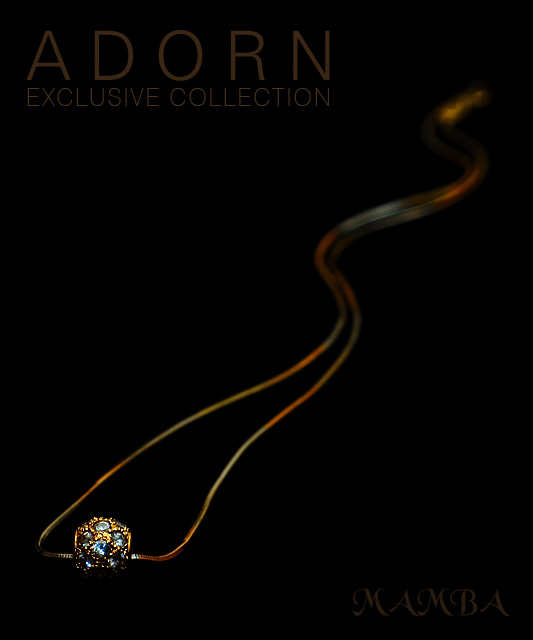
Astounding depth of field with great color. The layout to match the curves of a snake is just subtle enough not to be overpowering but without going unnoticed. This looks consumately professional. Have fun winning the challenge!
Clever idea, I would have prefered slightly greater depth of field to show more of the Neclace, however I appreciate this has been deliberatly chosen my you, for the affect.
I like this a bit. the composition is very good and your use of focus with the necklace going from focus to extreme blur is a very nice touch. Like the colos as well. The jewels and setting a just a bit dark and lose some detail.
This was great on top until i scrolled down and saw the jewel. I love the wispiness of the chain, but the jewel is lost too much in the black of the background.
Wow, this is awesome! I really love this shot! Reminds me of the Sentinels in The MAtrix for some reason. Lots of movement which gives the rock a very 'organic' feel. Colours are rich and lighting is dead on. Sharpness seems very good as well, but unfortunatly... and sadly... its SOOO SMALL! ARg! I want to get closer to my screen. I'd wished for something a bit closer. Text is also a bit too 'non existant'. Other then that, Very Very nice work! 8
tell me this isnt a real ad? you must be a pro at this... wow. everything about this screams professionalism :-)
I love you the text appears and disappers when you look at the image from different angles. the design aspects of the image are near flawless and i love the flowing composition of the necklace. well done 10
Looks like a snake at the top end! ;^) I like the color combinations you used for this. The text may be just a bit too subdued, but I like the choice of font style, size and color. Only wish I could see just a little more of the main piece of jewelry. Good luck in the challenge.
The mamba is one of the earth's most deadly poisonous snakes; when it bites, that's it. So I am entertained by the visual allusion to a snake in this photo as well as the textual one. It's a nice capture and negative space is used very well.
Unique layout/composition here.
Image overall is a bit on the dark side inmy opinion, or the main jewelry cluster could have been a little bigger to offsets the lighting. Text/font used is great,and I like the subdued appearance of it, but again just a little too dark to me.
The font, comp, and piece are outstanding. The font needs to be a different color as I can barely see the text. The piece should be larger and be the feature of the ad. Very nice,
Subtle, sophisticated, professional. Great composition. Couple of comments: mamba too dark I think and perhaps pendant stones are sharpened beyond the available detail. Great overall
Love the lines. Excellent choice of font and font color. Composition might have worked a bit better if the front end of the jewel was placed with an angle instead of a straight horizontal line... Good work!
I think you got hit by the same problem I did. Bet you composed this on an LCD monitor. But on CRT it's real dark and hard to read. So you'll probably lose a point or two for that.. But great composition...nicely done






 Add photograph to your favorites
 Add photographer to your favorites

 Photographer found comment helpful.


