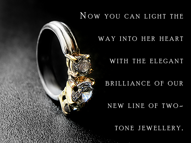
Photographed a ring on its side on the black surface of my desk with natural window light. Taken handheld. I realize it looks a little overexposed.. it's not. I processed it that way, as jewelry often appears to be in ads. I expect a bad score, though.
This is a very striking image and layout. I like the use of the strong light/dark division to emphasize the two-tone silver and gold. You've captured great detail in the gems and settings. Excellent. (9)
Interesting way to show the ring. Lighting is interesting, especially the way it splits the picture in half. Text is unfortunatly way too much to read and takes too much space, taking lots away from the jewel itself. Not sure on the texturized background tho, kind of takes away from the lustrate and shinny ring. 6
Great composition and lettering! Unfortunately the detail on the background in the lower left steals the focus of the viewer. Ring should be at a different angle to show off the two colors of the metal and to hightlight the stones.
The photo itself is great. Great lighting, and jewels look clear. The text takes away from the photo, however. Smaller, more elegant text might have done better. Good job, overall, tho.
First two lines would have been enough here I think. Great macro of the ring...one of the best lit shots in the challenge. This is definitely ad quality.
ok ok back to correct my score of 5 for typo - I stand corrected as to the spelling of JEWELRY . . .seem to forget that there are others who are not american on here : ) bump to 8
This ad is sooo close to being perfect. Great,great comp and i can feel the texture. Yoour choice of lighting is also very good However, I don't get the two-tone and I'd ask for more diamond and setting and less ring. I'd probably ask for a horizontal orientation.
Interesting choice of background. Good job on the DOF. I'm thinking you probably should have rotated the ring up a bit to show off the diamond and lose the photographers reflection in the band above the jewels. ;^)
Gosh diamonds are hard to photograph! :) Nice work, but the diamonds look like rocks more than they do diamonds. 7 The background also looks a little "hard".
What can I say, this is just exceptional! The only suggestion is to rotate the ring so that the center stone is angled up higher instead of resting on the surface and thus being angled down. Perhaps use a dot of glue to prop it in that position. Other than the position of the stones, you nailed this one with this excellent jewellery advertisment! 10
Nice photo. Well executed. Text over powers the subject in my opinion. Perhaps a smaller font and with less space between the lines would help. Fewer words would also limit the impact. How about "Light the way into her heart with the elegance of our new two-tone jewelry?"
The excessive space between the lines if forgivable, but the misspelling of jewelry... well... However, this shot is brilliant! You should try to get the store to use it. I really like it.





 Add photograph to your favorites
 Add photographer to your favorites

 Photographer found comment helpful.


