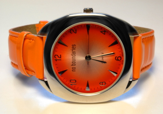
Removed a couple of dust marks (MUST get CCD cleaned!), cropped a smidge, brightness & Contrast bummped up a little, and radial Blur on the bezel to conceal wear.
This is my first attempt at a studio-type close-up shot. The lighting was really difficult w/o the right equipment. I was also using extension tubes, so I couldn't set my aperture, so the DOF is pure luck! After much time and tedious adjustments, I feel I got it just right.
Statistics
Place: 81 out of 159 Avg (all users): 5.4360 Avg (commenters): 6.2500 Avg (participants): 5.2621 Avg (non-participants): 5.5578 Views since voting: 937 Views during voting: 373 Votes: 250 Comments: 23 Favorites: 0
With 400+ entries, it's almost a miracle that you happen to get a crit club comment 3 times in a row...it's inconceivable that I would happen to get all 3. Wow.
This is the best of the 3 I've done in my opinion.
I really like the color, very nice oranges.
Lighting is very nice on the subject. If I had to change one thing it would be the surounding color. In the 'white' background, there are traces of orange and blue. I think that it might put more focus on the watch without added color in the surroundings.
I personally like the way you have it tilted. The 'no boundaries' label seems to indicate that something needs to be different here, and you did just that.
Excellent job concealing reflections on the watch face.
The small bit of bright orange wristband which is sort of in the background near the upper part of the watch face is a tad distracting, however, it doesn't have a major impact on the photo, but the photo would lose nothing if it were removed. If that makes sense.
Very nice shot. Look forward to seeing what comes up next. :)
~Heather~
Nicely done.
The tone & lack of glare help this shot a lot, as well as the blueish backlighting behind it.
In my own opinion, a vertical alignment would be better so the viewer wouldn't have to tip their head to read the watch face. (6)
Wow - that's some bright colors! ;^) I wish your background was pure white instead of yellowish looking. Incandescent lighting? Black might have worked well also. Good luck.
Nice & bright! would have preferred the straps to be a bit more symettrical, and maybe taken at a lower angle, so as not to see the brown of the leather inside. Nice shot all the same, good luck
very nice. I wish the bgr and foreground didn't have that orangish tint- the watch would stand out even more. Intriguing watch. Nice detail. Could use a bit more sharpness I think, and possible another way to present it (maybe change angle and crop larger? I don't know). Nice shot.
...hmmm ...OH! I get it. TIME - it's a watch - ok. Should've titled it "No Boundaries" or "Time has No Boundaries" Good job on the photo - assuming the face of the watch is orange, your lighting is good. Good luck.





 Add photograph to your favorites
 Add photographer to your favorites


 Photographer found comment helpful.


