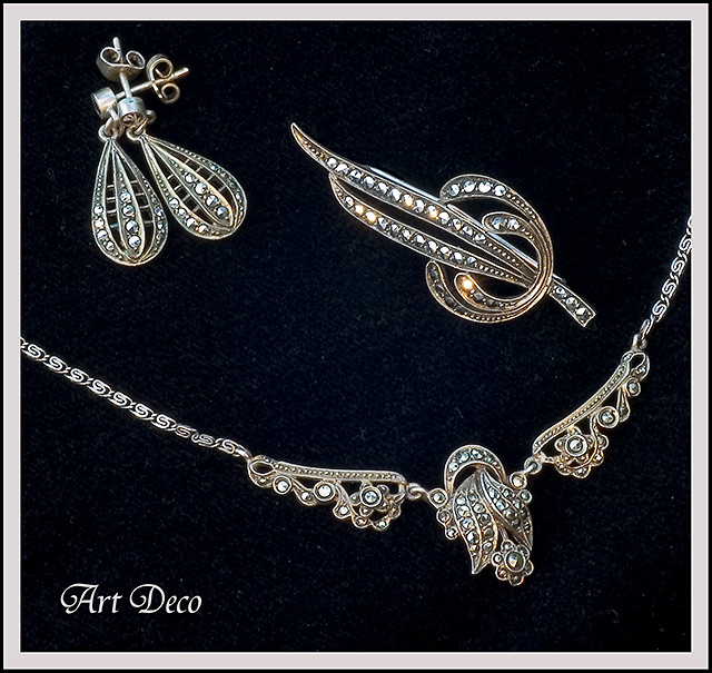
Very elegant. Crisp. The only minor things I would change would be to not show the backs of the earings. If this is some sort of cloth backing, I would put the earings through it to hide the backs. Also, there are a few turned links in the chain. Otherwise pretty much perfect. 9.
Nice. I like the fact that everything is in the dof. many of these jewel shots the dof is very small and you can not see half of the jewels Very well executed. the light is good 10
Composed welll as a three piece arrangement. Like the light reflecting off of a stone on the top right piece. Background looks dirty...that's a shame because otherwise this is a very nice job. Good luck.
Pretty nice image in quality and simplicity.
Lighting worked well and the text is complimentary vs. overdone.
Title of the shot (though not considered in my vote) is kind of at odds here, and may have been a litttle better had it been "Old Fashioned Collection" only. (8)
Nice, nice presentation, great comp and I like the texture of the background. Text is well defined and stands out. great comp. This ad is what I imagine when I think of Jewelry ads. Nice job! If I had to be picky, I'd ask for more contrast or saturation to get rid of the lint (only a slight distraction)
Great arrangement. Not sure the lettering does much for this shot but it doesn't distract, either. Good lighting too.
I recommend either shooting against a more uniformly black background, or adjusting the background in post processing to remove the texture and/or flecks of lint. 7
Good shot, if I were to correct something here, it would be the noisy backdrop the jewelry sits on. Though I am voting from a laptop where it might be more prevelant.






 Add photograph to your favorites
 Add photographer to your favorites


 Photographer found comment helpful.


