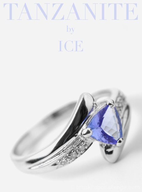
A shot of one of the rings I have bought for my wife over the years. I decided to go with the shallow depth of field to try to duplicate some ads I have seen. I really wanted to do a slight overlay on the text that would have made the top of the letters start to fade to black, and then back to the lilac type color on the bottom. It looked very nice and alot more ad like, but I feared the anal ones who would vote down for not meeting the challenge. As in the letters not being monochrome. So I tried to achieve the same sort of effect with the light color on the letters.
Statistics
Place: 12 out of 159 Avg (all users): 6.6443 Avg (commenters): 7.3167 Avg (participants): 6.4660 Avg (non-participants): 6.7667 Views since voting: 1820 Views during voting: 492 Votes: 253 Comments: 63 Favorites: 3 (view)
I really like the layout of this as an ad. The two-tone color scheme is perfect. I'm sure the narrow depth of field, keyed on the stone is intentional, but I feel like having just a bit more of the ring in stronger focus would be helpful. I do agree that having the back of the ring softened is a good call for the feel of the ad. (7)
Only comment I have is the DOF could have been a tad deeper (to encompass the whole leading edge of the ring and the stone). I really like this though.
Very professional looking. Good job with the typography!
I do like the shallow DOF although I think it could have used a touch more. A bit soft as well. Another issue is that the light reflected off of the stone is distracting. I would have loved to see more blue there.
As an artistic rendition this is excellent because of the shallow dof leaving only a hint and then the lovely blue type and stone. It may fall short as an advertising because of lack of detail. The composition is great. Bumping up.
Lettering is too light, and the photo of the ring is too soft. Great layout though and I like the lighting with the slight shadow under the right side of the ring. It give the image more depth. 5
The graphic and look of the add are quite good. Like the placement of the ring in the frame for an ad. Think the ring image itself it good compositionally, but I would have liked to have seen more of it in focus. Good job handling the lighting, no blowouts and you minimized the reflections.
Now this is a Jewellery shot awesome DOF and lovely white BG, I can almost picture this in the next major Jewellery TV Commercial. Excellent job no suggestions though sorry !!!
Good composition and overall lighting. Rotation of the ring makes the picture moer interesting I think. Too shallow DOF however, especially on the front of the ring; would have be nice to see all diamonds in sharp focus. From what I can tell, there seems to have a strong reflection of something white in the main stone. Text is subtle, well done.
I really love this. Perhaps your depth of field is slightly too restrictive, but it's a great idea. Nice composition, too, and good use of lettering. 8
At first glance I really like this. Nice color matching with the text and the ring stone. Composition is good as is the focus. Only negative is the reflection on the ringband - makes me want to know what it is. Doesn't look natural. Edge of the table maybe...? Overall, very nice. Good luck.
Very effective approach to the subject...the shallow DOF giving the stone more prominance.
The text will be seen as a welcome addition by some and a hindrance by others depending on taste...but it works for me.
this really looks like a poster. I love the use of white... wish a slightly larger dof was used on the ring bcos some part of the blue gem are blurry. 8
Nice comp and lighting. Good job with the reflections too. I think the font style and color complient the ring nicely. I predict a top 10 finish for this one. Well done.
Nice layout and comp. It needs a different DOF that accentuates the whole ring. Font needs to be in contrast with background to stand out more. Minor revisions that would bring a smile to most ad people. Nice job.
Superb lighting mastery. Composition is very good. Text is very nice and brings lots of synergy to the shot. Masterful. One thing i don't like is the big reflection on the jewel. Its very subjective, but its a bit too big for me. Either way, i suspect this is gonna make it first place. 9






 Add photograph to your favorites
 Add photographer to your favorites

 Photographer found comment helpful.


