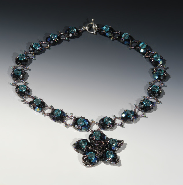
What I like about this one is that you can see the entire piece. Some of the other entries only showed part of the piece, and if I were actually considering buying the jewelry, I'd like to see how the entire thing looks.
Background lies too flat to offset this extraordinary piece. Shadows confuse the eye and detail of the craftsmanship. Good use of gradient lighting from top to bottom.
Nice job of lighting and use of background to tie the colors in with the jewelry item. I think the light could have been difused just a little more to tone down some of the hard glare coming from some faces of the stones. JMO. Overall, well done. Good luck in the challenge.
Perhaps a bit too centered/symmetrical for a good advertisement.
Shadows are a minor distraction (not too bad though), yet the lighting is decent as is the clarity.





 Add photograph to your favorites
 Add photographer to your favorites


 Photographer found comment helpful.


