boone, I'm having to go back and change my notes...I mentioned your colors were dull...I just found out by viewing the images on my work computer that my home computer (where I did the voting from) is lousy and will have to do some adjusting myself. That is going to hurt my challenge submissions too dang it.
I understand the desire to enter a challenge when it comes up but sometimes I feel people just enter anything just so they can say they entered. Your image feels like this.
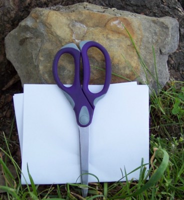
Please consider the following as helpful as that is the intent of it. First your crop is too tight, leave some room for the eye to see and not feel so compacted to the small space. 2. Try and keep from centereing your image, use the rule of 3rds if at all possible (trust me I'm still fighting this tendancy to center stuff). When you move stuff to 1/3 of the image you will leave more image to see and becomes less boring. 3. Your image is a little dull in colors, see if you can add more light or adjust it in the computer. Remember to check the submission rules of editing first so you don't inadverntaly get DQ'd. and last...the scissors seem a little blurry, this could very well be from the compression of the image so your original may be good. I would love to see your uncropped one and see if there is something that could have been done to help this ordinary image become extrodinary. PM me if you have questons, I am by far not an expert but have learned a lot from here.
Though you've included all three items in your shot, your composition lacks creativity and impact. The picture looks too soft and I find it to be too small, when you have the option to submit 640x640px sized pictures.
Maybe by adding contrast and sharpenning the image, it'll look better.
No offense, but this composition isn't very compelling. I think the winner of a challenge like this will be one who can show the objects in an interesting and unusual way. I think with a little more thought you could have come up with a way to photograph these objects more dynamically. 5 for being on topic, well exposed and in focus.
Well yes you have all three elements in the image, but thers nothing else to commend it, no artistry, no use of lighting, just plain flat and dare I say it boring !!






 Add photograph to your favorites
 Add photographer to your favorites


