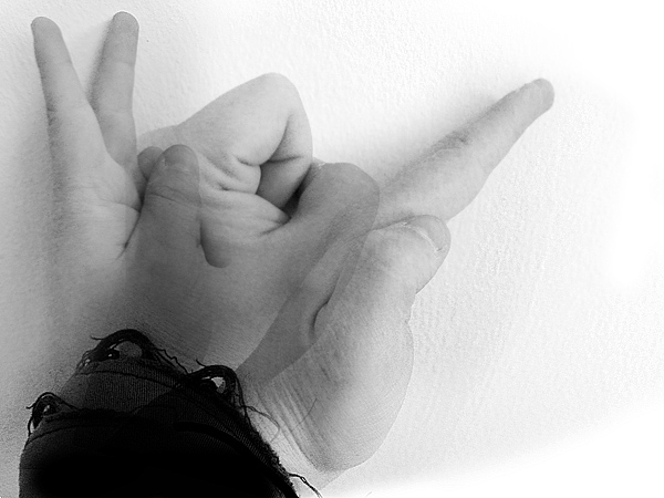
A little bit of contrast could have helped this I think. The ripped sleeve is also a bit distracting because it is so dark compared to the rest of the picture.
Cool shot though.
I like the idea, but didn't like that the images were so far on top of each other. I think that by spreading them out in the frame just a bit, to be able to tell where one ends, and the other begins would have allowed me to understand it a bit better, and bring up my score quite a bit.
I think you had a very good idea, which failed to be well executed. Your image is a bit confusing, has too much noise and brightness. Maybe decreasing brightness and contrast would help improve you photo. Good luck.







 Add photograph to your favorites
 Add photographer to your favorites


 Photographer found comment helpful.