| Author | Thread |
Comments Made During the Challenge  |
|
|
04/26/2005 11:42:16 PM |
|
this is a great candid. it's kind of a stretch for this challenge, but i enjoy it quite a bit. |
|
 Photographer found comment helpful. Photographer found comment helpful. |
|
|
04/26/2005 06:49:01 PM |
|
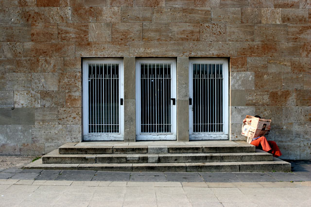
I like thisd interpretation of the challenge, and I love the framing of the image. The built-in "almost symmetry" of the slope of the pavement is quite compelling. The color is wonderful. Very strong entry. |
|
| Photographer found comment helpful. |
|
|
04/26/2005 12:46:06 PM |
|
I like the geometric shapes, and I like that you centered them. Works well...I think particularly so because you have the guy reading off to the right. Without him, the shot may have had a sterile look, with him it is very appealing. Nice lighting on the doors. |
|
| Photographer found comment helpful. |
|
|
04/26/2005 04:07:26 AM |
|
nice clear image great detail |
|
| Photographer found comment helpful. |
|
|
04/25/2005 02:06:21 PM |
|
Great compostion and light. My favorite so far! |
|
| Photographer found comment helpful. |
|
|
04/25/2005 12:22:51 PM |
|
am i not getting something? |
|
|
|
04/25/2005 09:38:51 AM |
|
Interesting shot, I particularly like the fact it's taken on a slight hill. Shame the shot is slightly overexposed. |
|
| Photographer found comment helpful. |
|
|
04/23/2005 02:16:47 PM |
|
I think this is a simple matter of taste for me, so please don't take it personally. I don't find the subject matter especially interesting or striking in any way - at least in the way it is currently presented. HOWEVER, I think it's a very nice shot - symmetrical, asymmetrical, balanced, decent lighting, and contains two of the three possible elements for this particular theme. You know, I almost think this content would be more appealing in a black & white or sepia toned image. It is so severe with the rock/marble and steel doors, that It looks like a death camp in the Middle East or the Sudan, and the person reading the newspaper in red pants seems very out of place against that background... Sorry. |
|
| Photographer found comment helpful. |
|
|
04/22/2005 04:40:55 PM |
|
love the simplicity. Seems a little off but I am not sure if the image is tilted or if the sidewalk just makes it look that way. Love the color range and the crop and the comp. 9 from me. |
|
| Photographer found comment helpful. |
|
|
04/20/2005 07:50:56 PM |
|
Very nice catch. Like this picture very much, but I cant help noticing the person reading the paper is out fo focus. Anyway, good composition and nice approach of the challenge. Well done. |
|
| Photographer found comment helpful. |
|
|
04/20/2005 04:14:47 AM |
|
Well I had a similar idea to this, chose to go with something else - but Im pretty sure that if I'd gone with this idea there's no way I would have come up with a composition this engaging... great job! 8 |
|
| Photographer found comment helpful. |
Theme:
Classic /
Light /
Dark
Home -
Challenges -
Community -
League -
Photos -
Cameras -
Lenses -
Learn -
Help -
Terms of Use -
Privacy -
Top ^
DPChallenge, and website content and design, Copyright © 2001-2026 Challenging Technologies, LLC.
All digital photo copyrights belong to the photographers and may not be used without permission.
Current Server Time: 10/15/2026 06:11:57 PM EDT.






 Add photograph to your favorites
 Add photographer to your favorites


