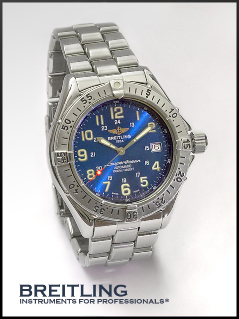
Here's another go-around at submitting a photo of my Breitling SuperOcean, and hopefully it will perform better than my dismal previous attempt in the Mechanical challenge.
No flash was used. A flashlight was directed from the right to add blue metallic sheen on watch face.
- RAW conversion to JPG
- rotate
- levels
- saturation to boost red and blue channels in watch face
- desaturation to watch band
- clone out watch holder and shadow
- clone out side shadow
- burn, dodge, and sponge
- clone out speckles and scratches
- photo filter: 10% sepia tone to warm up slightly
- border
- save for web
Statistics
Place: 3 out of 159 Avg (all users): 7.0520 Avg (commenters): 8.1346 Avg (participants): 6.9700 Avg (non-participants): 7.1067 Views since voting: 8716 Views during voting: 447 Votes: 250 Comments: 74 Favorites: 4 (view)
Just one nitpicky thing is the lack of focus on some of the smaller text on the watch face in the centre of the dial. I can't tell if this is related to how the picture was taken or is present on the watch itself.
Not a lack of focus, but rather a lack of resolution due to the image size constraints.
First impression: I could picture this in a magazine.
Composition: Positioned well to draw the viewers attention to the face of the watch. The text is in a location so it is not distracting and the font seems to be of an appropriate size.
Exposure: Seems to be bang on. There are no extreme shadows or highlights.
Impact: This is a very modest image as is the subject matter and as an advertisement it would probably attract the right type of consumer.
Just one nitpicky thing is the lack of focus on some of the smaller text on the watch face in the centre of the dial. I can't tell if this is related to how the picture was taken or is present on the watch itself.
Apparently this one did go over well, and it would be a shot Breitling would be proud of. I almost bought the SuperOcean a while back, but went for the Chrono Avenger instead. Nice to see others with some class around here. ;0)
Great control over reflections and light. You even took the shot at 10:10...seems to be the most accepted time to photograph a watch. Also, thanks for using a short exposure time to keep the second hand from blurring.
Well composed and taken shot. A general observation would be that the picture would have soightly more balance of the secoond hand were at about 31 or 32 seconds
Very professionally done. Nice to see someone shooting a watch with the hands in balance, most didn't bother. Overall tonalities a bit flat, and this is hurting the luminace of the metal. A bit of a goose in levels would do wonders. Well-balanced, a strong entry.
No improvements what so ever to this yet the only thing that is distracting is the bezel hanging out yet I know that to get the 10 to 2 position and freeze this in motion this is the only way, send this to Breitling you might get a job :0) Good luck.
Very professional in composition and quality.
Lighting is very well done and the text/font is perfect in it's size, style & placement.
Perhaps one of the best in this challenge. (10)
Very nice - the best wristwatch shot of the challenge. One of my top 5.
I like the 10:10 hands setting - many entries ignored this common trick to achieve symmetry and show the background of the watch in a best possible manner.
Like the soft light. Bumping up to 9 on the second pass.
yessss good typography!
I do appreciate these things.
Great lighting, too - nice and smooth on the metal, nothing burned out, and a great highlight on the watch face.
(8)
Nice job. Brilliant lighting and good control of reflections. Font style and color are nice. They look like there meant to be there unlike some others. Also the border compliments the image. I would have made the border a little less black and more liek the font color. This is in my top 10. Good job.
this is a great composition except for the light streak across the watch face. Everything else works so well here that I have to assume that it was intentional on your part - if so, then we just have to disagree on what works but I find it distracts from an otherwise beautifully lit image.







 Who says girls have all the fun?
 Add photograph to your favorites
 Add photographer to your favorites


 Photographer found comment helpful.


