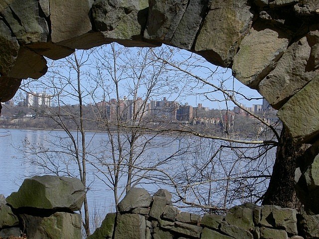
Now that's looking outside the box...or whatever that is. You've made something different than the norm submission. I like the idea since you didn't encompass the entire archway but didn't cut too much out either. Your colors seem a little muted but overall a creative idea. Good luck
I like the concept. The trees in the center are too busy and distract/detract from the city skyline. The left side of the arch is cut off, which gives an out of balance feel to the photo which is emphasized by the tilted horizon. On the plus side, the focus and DOF is good, and the lighting on the stones is good.
This is so cool looking. I think just a slight rotate would have straighted it up and made it look even a little more striking! But it's a really neat picture anyway!!! 9







 Add photograph to your favorites
 Add photographer to your favorites


 Photographer found comment helpful.


