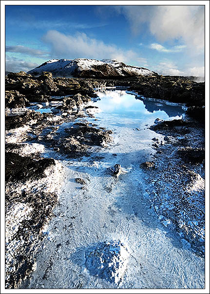
Interesting colors - just three tones - blue, black and white. It works. I like all the textures too. It does seem oversharpened to me as I can see a white line along the edge of the mountains.
Compositionally strong - that open space leads into the lagoon and the mountain nicely. The slight wide-angle element really helpes this - a classic approach, but always effective. A minor point, but I wonder if you couldn't have framed things a little better - take the mountain more to the left of frame say, and perhaps that foreground lump to the right, to add a diagonal line to the image as well? What this sufferes from, to my mind, is a lack of detail, and that hurts it quite a bit: whether it's from re-sizing, or your camera, or compression, or over-sharpening, or just the original image is impossible to tell, but something has made most of the foreground very blocky (small blocks, but still ...) and that would be the element you need to add to get this shot seriously amongst the high scores. It's odd, because the sky feels like it still has good detail. I think you've pushed the exposure just too far, also - the highlights have 'gone', and that might well be contributing to that lack of detail also. It's good though - despite those points - and without more information impossible to really suggest how things might be improved.
this is a wild image. i love the colors and the composition, but also feel it is a bit oversharpened. this definitely has great postcard appeal. hope you get to shoot here often! good luck!







 Add photograph to your favorites
 Add photographer to your favorites


 Photographer found comment helpful.


