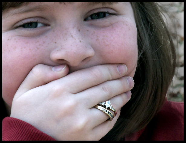
Nice picture overall, only problem I have is it appears that my eyes are conflicted. They want to look at the girls eyes, but at the same time the rings. It's distracting. Other than that it's a really nice picture.
Cute shot and put a smile on my face when I saw it.
Not really sure this fits the "classic" Jewelry Advertising look, but this one will probably by far be more meaningful years down the road. (5)
Cute subject and pose, nice idea. The rings do not fit, but I'll let that go thinking that she is playing dress up. The detail and exposure on the jewelry is not as clear as it could be as the hand area appears to be a bit overexposed.
Great idea and although my eye is atratced to the jewellery as a focla point there is too much reflection off the side of the ring unfortunately yet a great take on the challenge and not as boring as many of the others, a good eye for a good shot / idea. good luck
Cute shot and lovely expression, however there is more emphasis on the little girl's expression than the jewelry itself. There could be two different approches to throw interest back on the ring. Well thought out text or desaturating everything but the ring. Lighting on the ring could have been a tad bit better as some of the detail is blown out a bit.
Cute pic. In this particuliar case, i wished the little girl's face would be in focus, which it isn't. Since this shot is threated as a Portrait, its important to have the face in focus (just learning this myself) but in this case, doesn't work very well. Colours are dull and the lighting, especially on the rings, is not very good, which doesn't do any justice to them. 5
This is a cute "advertisement". The only problem I see is that the focus and lighting on the rings needs to be a little bolder to focus attention where it needs to be.
Cute, but I think your model is a bit young for diamonds - no? I like the composition. The lighting on the girl is ok, although I would like to see some sparkle in her eyes. The rings have lost some impact along the way. A little hot perhaps...just not clear and shiny as you would expect jewelry to be. Fun idea. Good luck in the challenge.
Slight blue cast to the shot. The child is cute and expressive, but the ring itself gets lost in the shot. The lighting for it doesn't is flat and the rock itself has no depth.
Composition: for advertising purposes I find the composition poor (sorry)
Lighting: lighting on the jewelry is poor, the diamonds look white and the setting looks dirty
Color: too red in areas that are not the jewelry, verywhite on jewelry
Clarity: good
Lettering: has no space for advertising other than the little girls face or hand
Unfortunately, the light reflection off the rings is not helping. Nice idea, with a girl obviously wearing adult's jewelry. Not the best execution, though. 4.





 Add photograph to your favorites
 Add photographer to your favorites


 Photographer found comment helpful.


