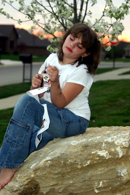
I think what you were trying to do here is put a pretty tree with a pretty sky behind this pretty girl. What happened was you made the illusion that a tree is growing out of her head. I think this could have worked had the tree been much bigger and filling most of the background behind the girl.
I like her pose, she looks very comfortable. I'm not sure if the makeup was done for the photo or not, but I personally think that the lipstick is too bright and distracts from her beauty. When people look at her, the first thing they should notice should not be her lipstick.
You definately got the rock paper scissors thing down. And creative too.
Having the background blurred was beneficial to the visual appeal here. I like that although you can tell there are houses back there, you can't really see them or any detail in them. Nice DOF.
Lighting seems ok. No distracting shadows or hot spots. Nice even lighting on the girl.
Overall I think the image is creative and fun, but next time watch for placement of the tree.
~Heather~
Got all 3! And sky to boot! Boardering a shapshot look though - maybe a change in angle would have bumped it up and elimiated a bunch of the houses in the background in the process.. 8
The composition is not too bad, but I dislike the "cutting work" she's doing (why tear up a drawing? cutting silhouettes would have been better) and I don't like the make-up on her lips
My only issue with this photo is that you composed it with the tree growing from here head. A foot or two one way or the other would have eliminated that photographic faux pas.






 Add photograph to your favorites
 Add photographer to your favorites

 Photographer found comment helpful.


