Thank you for submiting your photo to the DPC, Free Study VIII.
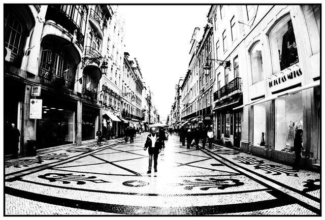
Very interesting perspective and capture here. It shows a day in a life of a retail area. Full of people and stores all around. It is intriguing as well that everything seems to be in order. The way you photographed it, it appears that everything fell into place on cue. The way the man in front is position, and the rest of the objects and elements. The ground has an interesting display as well. Is this a paved street with painting on it?
Your use of black and white is perfect. Giving the image a feel and mood of time and space. The use of an "Fisheye" lens also helped capture the breath of the area. I am assuming its a "Fisheye" lens, because of the f 2.8 aperture opening. Wide angle lens also provide a distortion similar to "Fisheye" lens. I would also guess that a wide angle about 12-24 lens would have also capture the width of the area, as shown here.
Technically speaking, the same thing that makes this image appealing is the same thing that distracts from it. The white balance area's hide details of the photo. The horizon is a white wash eye point. The light that is coming from the background is also hiding the foreground area.
It is very artistic and will generate lots of interest, as long as people take the time to study your composition.
Really like the fish eye, and the stark look. I find the man in center is in such a strong position that I would like to see his face more. Interesting shot, well done.
Love this shot. That pavement / cobblestone is great. I like how he's walking right down the center of the street, and how the distortion from the lens makes the buildings look like they are closing in over the pedestrians. Really a beautiful image. 9
Great hi key
i love the way you have blown out the unnessesary syuf
10
good luck
I bet you are getting the same comments as me about your picture being blown out.
Good choice to do this
wild image you have here. it might be stronger if you were in a little closer to the first person and/or if the vanishing point was a bit further off-center. the light you've caught is really edgy. nice effort, good luck!
Seems like the highlights went a bit too far in the upper left, but the effect overall is very cool, and the guy in the middle is a perfect compliment. Wierd, but very cool.
Cool - Creative and nice effect. Too bad the man in the middle is there... he is a little distracting to a scene thhat is interesting on its own. The road leads the eye into the scene so the man wasn't needed.







 Add photograph to your favorites
 Add photographer to your favorites

 Photographer found comment helpful.


