Rule #1 - It's always a good idea to post your own thoughts and insights on a photo when you are asking for an in-depth critique. If you don't you may not get any information that you don't already know, and it could be wasting the commenters time.
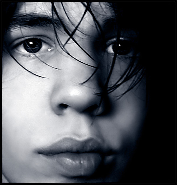
I like the composition of this photo quite a bit, but the image quality is simply poor. It looks like camera shake from a low light situation that has had a correction attempt with the unsharp mask. Maybe some additional work on light and exposure would help in this area...
This photo looks good from the thumb, but enlarging it in this form reveals that it is of a low resolution and 'pixelated'. If not for this major downfall, it would be a great shot.
There seem to be compression artifacts and halos from oversharpening around the hair. Looks like neat image has caused some problems with this photo. IMHO.
This shot has a lot going for it - it's well composed, and the close crop works very well. The toning is an interesting choice, and there is some real personality coming through in the image as a whole. It seems a tad too out of focus, though, or something to that effect - overcompressed, upsampled, somehow degraded. Maybe if it were downsized a tad there would appear to be a bit more sharpness? Regardless, though, I like what you have done here. This is a moody shot that does stand out.
This is a good example of when a good crop can reinforce the strengh of the picture. Power of those eyes, and the lines of those lips makes of this picture one of my favorites for this challenge. Too bad the blown out areas on the cheek and nose.
That's a very nice picture with poor resolution. I took a couple of steps away from my screen to avoid that effect and like I said, it's really a nice portrait.
I really like the lightand the crop here, but the processing leaves something to be desired. Looks like a lot of artifacts around his hair and eyes and nostrils.






 Add photograph to your favorites
 Add photographer to your favorites

 Photographer found comment helpful.


